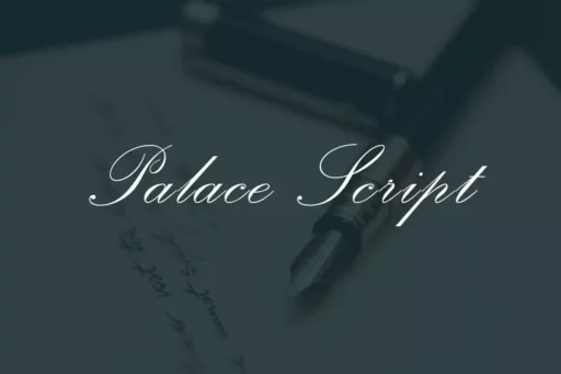
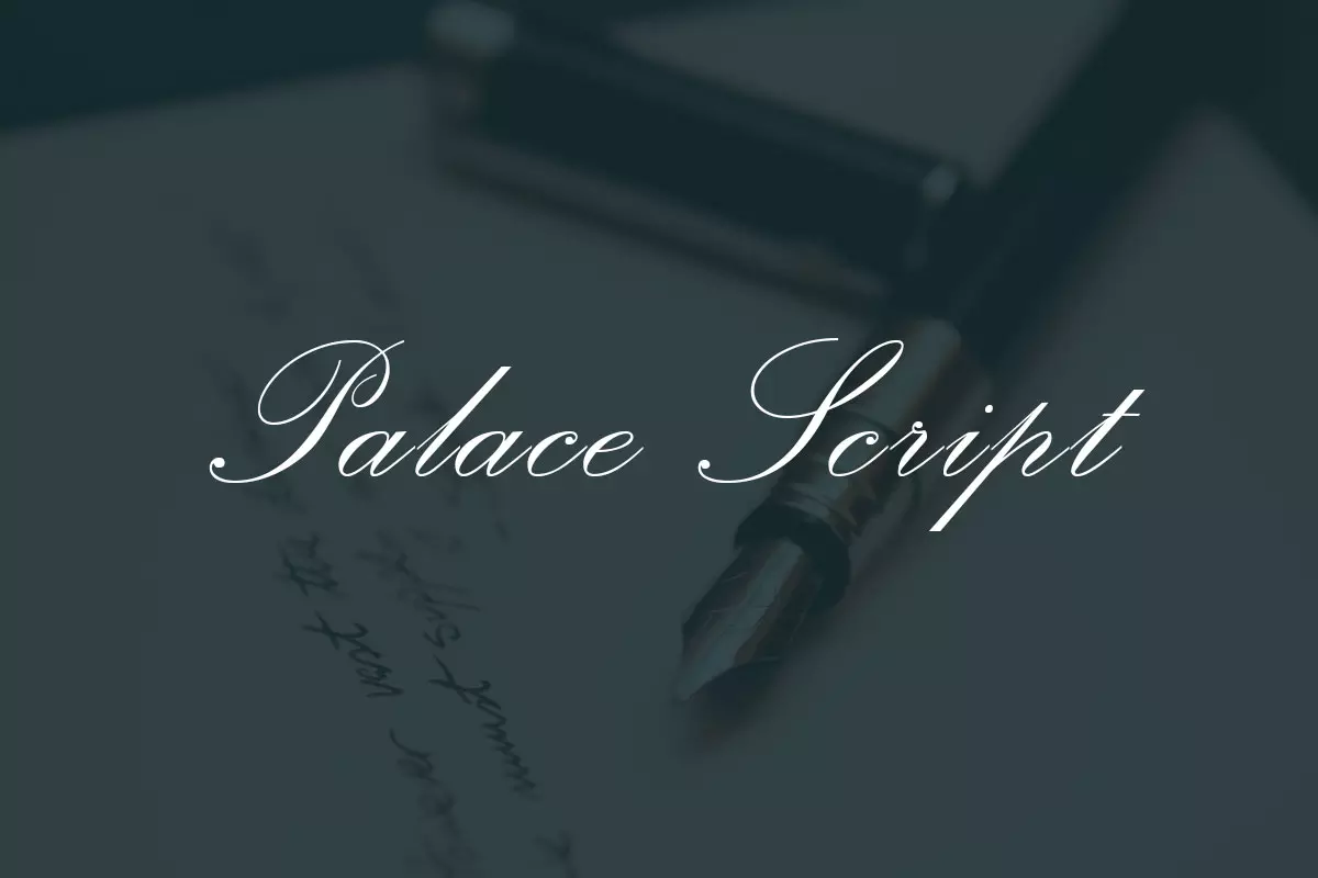
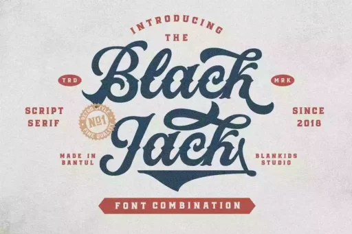
Palace Script is a formal English script font that modernizes a classic traditional handwriting and calligraphy style. Its appearance resembles handwriting from the 19th century, adding an element of elegance to the contemporary design. The font’s name conveys visions of royal residences and magnificent villas, suggesting that it is appropriate for elite projects.
History
Palace Script was first developed in the early part of the 20th century, a period that saw the use of fancy and decorative scripts in design and advertising. It was first introduced by the Stephenson Blake company in 1923 and later on, followed by Monotype. The font’s name is thought to be derived from the word palace, which connotes regal and elegant characteristics.
Palace Script is based on copperplate scripts of the eighteenth and nineteenth centuries that have many elaborated characteristics in work and the contrast of thick and thin lines. It presents these scripts in a much more handsome and sophisticated manner.
Features
Palace script has a distinct feature of thick and thin strokes, swashes, and interconnected letters. The font looks like it was hand written and it has fluidity that makes it easy to read and aesthetically pleasing.
An important characteristic of Palace Script is the presence of swashes and other embellishments. There is an added beauty and depth to these, which makes each letter a piece of art on its own. The font’s uppercase letters are more exaggerated and tend to have elements that rise or fall from the standard height of the letter.
Usage
Palace Script is a font that is best to use in almost any field, be it professional or personal. It is mostly suitable to use for formal invitations, announcements, and any other document that requires some formality. It also finds use in logos, headlines, and any other display typography. Palace Script is a highly elaborate font, so it is advisable to use it in moderation. It can be quite confusing if overused. But when applied in moderation, it can give a very elegant and pleasant look to any design.
You can combine it with serif or sans serif fonts in order to enhance the contrast which would make it look elegant or you can use it alone in order to create the feeling of elegance which is timeless. Thus, digitization has been done in such a manner that even on a digital medium, the elegance of Palace Script is maintained and its fine details do not get lost.
Similar Fonts
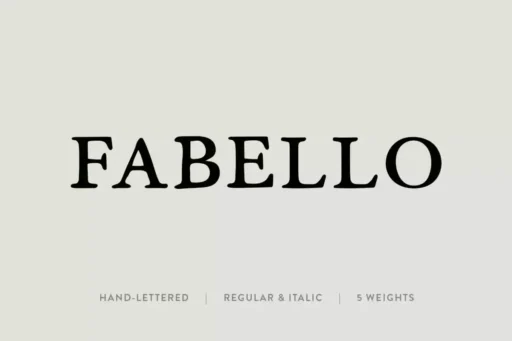
Palace Script has quite a number of similar fonts with the same characteristics. The following is a list of fonts that are in the same category as Palace Script.
Edwardian Script: This font has a similar high contrast and dramatic flourishes, but has a slightly more contemporary feel to it.
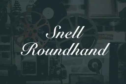
Bickham Script: This font is also derived from copperplate scripts but has a more relaxed and playful look to it.
Brush Script: This font also has the brush stroke effect but here the look and feel is casual and less structured.
Palace Script Font Free Download


