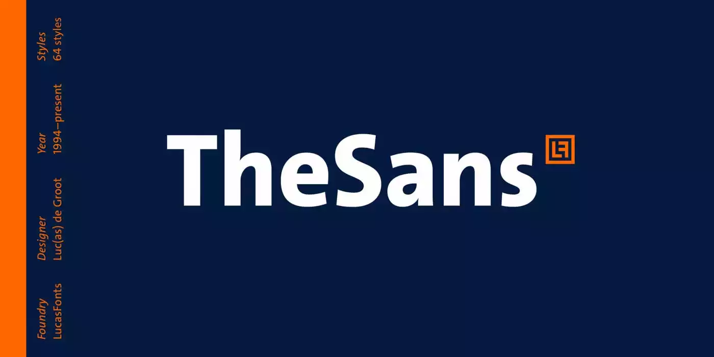
TheSans is a modern sans serif font family of the Thesis superfamily by the Dutch type designer Luc(as) de Groot. Font TheSans has become the face of thousands of organisations, publications and websites. It is in frequent use for corporate design, editorial design and new media. The TheSans font family is available in 76 different styles and family packages to give the designers the freedom to use any weight or style in their designs.
History of TheSans Font Family
Luc(as) de Groot designed this font in 1994, which LucasFonts distributed. He wanted to create a font that would easily fit into any context yet still be easily readable and visually appealing. This typeface was released by LucasFonts and became pretty popular because of its numerous styles and versatility in design.
Features
The Sans has perhaps one of the most easily recognizable features in that it comes in a number of weights and widths. This typeface family is available in ultra-light to black weights and from condensed to extended widths. This enables the designer to move beyond the simple choice of serif and sans-serif typefaces but not into the territory of decorative or novelty fonts.
Apart from the different weights and widths, TheSans has several other features, including the hairlines font set, which is very helpful in detailed work and small prints. It also supports a number of languages, for instance, English, Spanish, German, French, Dutch, Turkish, Czech, Polish, Slovak, Hungarian, Romanian, Croatian, Latvian, Arabic, Persian, Pashto, Sindhi, Urdu, Russian and Ukrainian, Bulgarian, Serbian, Greek, etc.
Furthermore, TheSans offers different figure styles such as tabular lining figures, proportional lining figures, tabular old style figures, proportional old style figures, and lining figures low. This flexibility implies that designers can develop the characters in a way they feel most appropriate for the particular project, which means that the balance is always right.
Usage
Due to its very broad application range, TheSans is an ideal choice for various fields and projects. It is often used in business design to depict professionalism, accuracy, and contemporaneity. Further, Its simplicity and absence of bold colours or fonts make it perfect for business logos, company brochures, presentations, and websites.
Typography is the other area where TheSans is quite effective in particularly editorial design. This font has good readability, and it comes in numerous weights, making it appropriate for use in headlines, subheaders, body texts, and captions. It is also suitable to incorporate visually arresting designs that map out the textual content flow for easier reading.
In new media, TheSans has been as versatile as it can be. It also has a minimalist design that easily fits the interface of a digital platform. It is a perfect choice for mobile application interfaces and social media designs and icons to enhance the usability and aesthetics of a particular site or mobile application.
Similar Fonts to TheSans Font
TheSans is quite a unique font in its own category; however, there are a few other similar fonts we can use that share the same features as this font. Some of them include
TheSans Font Free Download


