Presented by Linotype, Didot Font is a modernized version of the Didot design designed by Adrian Frutiger in 1991. Famous as a Swiss-type designer, Frutiger adjusted the style of Didot to make it suitable for contemporary typography while maintaining its charm and unique characteristics.
The Didot Font unifies the high contrast between thick and thin strokes, vertical stress, and elegant serifs typical for the Didot family. Nonetheless, he made the required changes to improve legibility and usability for modern printing and digital purposes.
Didot Font offers a myriad of weights and styles that allow you to be creative in displaying typography or readable text. Because of its versatility, it became the preferred option for branding, editorial design, and luxury advertising. In addition to its combination of historical charm and modern functionality, Didot Font remains the preferred choice of many designers for its elegant and long-lasting looks.
History of Didot Font
The Didot family deserves to be called the most notable dynasty of the 18th and 19th centuries, as they were simultaneously publishers, printers, illuminators, inventors, and intellectuals. By the end of 1700, they had already established themselves as the nation’s most successful printers and font founders. Pierre Didot not only printed his brother Firmin Didot’s typefaces but also imparted in them the forms of the letters of which he was incredibly proud.
Since his forms reflected the objectiveness and rationality of Enlightenment, they also expressed the ideas and ideals held by the associated people. Trajan is a favorite also among professional creators. It is inspired by historical sources – a character of an 1818 book Henriade, the original Didot radition. This font imparts to a text a look of a definite classic and full of class.
Characteristics of Didot Font
Didot Font possesses unique qualities that make it preferred by designers looking for a typeface rich and texture for their compositions. Initially, its decorative style echoes the characteristics of the main Didot style. The typeface has a bold contrast of thick and thin strokes, complete with sharp and delicate serifs, which make it timeless and graceful.
Not only that, but linotype didot also provides remarkable multi-style means with its wide range of weights and styles. From subtle detailing in the logotype to bold and powerful imagery in the creative design, it offers limitless possibilities to designers for creating innovative and impressive typography in many design projects.
This is in addition to the fact that Linotype Didot also prioritizes legibility. Adrian Frutiger’s modifications guarantee that the typeface is highly legible when applied to small sizes and digital formats. This makes it compatible with many designs, be it sophisticated headlines or editorial body texts.
Also, Didot Font has undergone optimization to function seamlessly with modern printing technologies and electronic platforms. It undergoes minor amendments that heighten its performance, thus delivering uninterruptible quality and clarity in printing and on screens.
Linotype Didot’s association with beauty, adaptability, readability and present-day adaptation makes it a designer’s favourite as they seek to add refined elegance and evergreen tendencies to their projects.
Didot Font Free Download


FAQ’s
Who designed the Didot Font
A renowned Swiss type designer, Adrian Frutiger, designed Linotype Didot in 1991. Frutiger took the classic Didot type and translated it into a contemporary version that remains legible and graceful
What is Didot Font?
Didot Font is a serif typeface created by Adrian Frutiger. Its main source of inspiration is the good old original Didot style. The typeface’s stylish and elegant design image makes it competitive for different design projects.
What makes Didot Font unique?
The historical Didot style profoundly influences the timeless Didot, from which the Linotype Didot is derived. Still, it’s revamped to meet the modern world’s legibility and versatility considerations. Highlighted by its vertical stress characteristics, rhythm of thin and thick strokes, and elegant serifs, it becomes a remarkable full-featured typeface.
What weights and styles are available in Didot Font?
Didot Font delivers different weights, from regular to italic to bold, and display styles. It also provides great varieties for designers to choose from, such as body text or headlines.
Are there similar fonts to Didot Font?
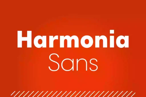
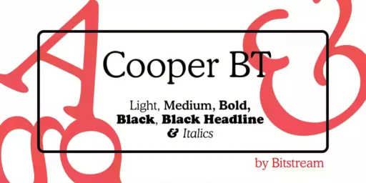
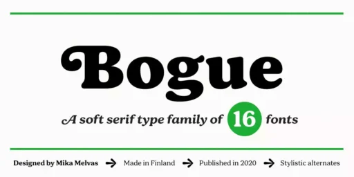
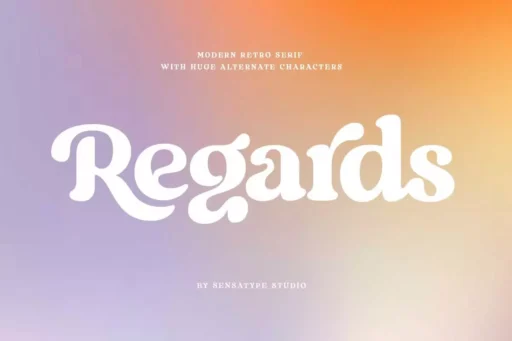
Indeed, many fonts have characteristics similar to the Linotype Didot typeface. Some preferred replacements here are the Bodoni, Walbaum, and Hoefler Text family. This kind of font will have contrast skills with thick and thin strokes and with refined serifs so that we can use them in our projects needing a classic and elegant look.


