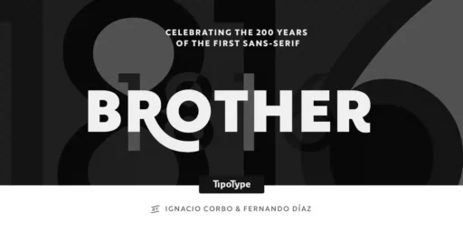
Brother 1816, a sans serif font family from the Chile-based creative studio TipoType, is a unique typeface that incorporates historical influences with today’s design requirements. The company by Fernando Díaz and Ignacio Corbo wanted to design a new typeface that would be modern and flexible, which can mimic the trends of today’s typography.
History of Brother 1816
The font’s name, Brother 1816, alludes to typography traditions. The number 1816 refers to the early nineteenth century, which is known for the development of the first sans serif fonts. The term “Brother” reflects the typeface’s positioning as a practically oriented and all-around family member that can be useful in any project.
The concept behind the design of the Brother 1816 font was to combine the geometric sauf for its legibility with the more organic humanistic forms. This approach to typography is not unusual for the contemporary design field, which features a growing tendency to blur the lines between various type styles and a preference for multitalented and adaptive typefaces.
Features
The development of Brother 1816 was a deliberate process, and the TipoType team worked on ensuring it had a great font library suitable for many different designs. The typeface includes 32 fonts split into two groups: The normal and printed families each have 16 weights. It thus offers a high level of versatility in use, ranging from thin weights that can be used for refined, premium-level branding to black weights suitable for more attention-catching headlines and advertising.
All the font variants in the Brother 1816 collection contain more than 460 glyphs, including more than 20 stylistic sets, swashes, fractions, and ordinals. This versatility allows Brother 1816 to fit into various design environments, and since it is a studio product, it had to encompass the idea of innovation with freedom.
Another special aspect of Brother 1816 is the humanistic design of the font, which is very legible even when printed in a smaller size. This makes it ideal for detailed branding projects, editorial design, and signage where legibility is of paramount importance. However, its geometric characteristics are quite efficient in large-scale designs that need uniqueness and attention to visualization, such as headlines and posters.
Usage
The design of Brother 1816 is quite unique and can be easily adapted to several uses. In branding, it can speak of stability and corporateness or give off the impression of being new-age and progressive based on the weight and style selected. Its most widespread use is in digital design because of its simplicity and readability, making it ideal for application interfaces and electronic publications.
However, the typeface has become popular in editorial design, as it provides legibility without compromising aesthetics. Brother 1816 delivers reliable performance for business documents with texts and minimal designs to make them professional and visually appealing.
Brother 1816 Black Font Free Download


What’s Included
- Brother 1816 Black
- Brother 1816 Black Italic
- Brother 1816 Bold
- Brother 1816 Bold Italic
- Brother 1816 Book
- Brother 1816 Book Italic
- Brother 1816 ExtraBold
- Brother 1816 ExtraBold Italic
- Brother 1816 Light
- Brother 1816 Light Italic
- Brother 1816 Medium
- Brother 1816 Medium Italic
- Brother 1816 Printed Black
- Brother 1816 Printed Black Italic
- Brother 1816 Printed Bold
- Brother 1816 Printed Bold Italic
- Brother 1816 Printed Book
- Brother 1816 Printed Book Italic
- Brother 1816 Printed ExtraBold
- Brother 1816 Printed ExtraBold Italic
- Brother 1816 Printed Light
- Brother 1816 Printed Light Italic
- Brother 1816 Printed Medium
- Brother 1816 Printed Medium Italic
- Brother 1816 Printed Regular
- Brother 1816 Printed Regular Italic
- Brother 1816 Printed Thin
- Brother 1816 Printed Thin Italic
- Brother 1816 Regular
- Brother 1816 Regular Italic
- Brother 1816 Thin
- Brother 1816 Thin Italic

