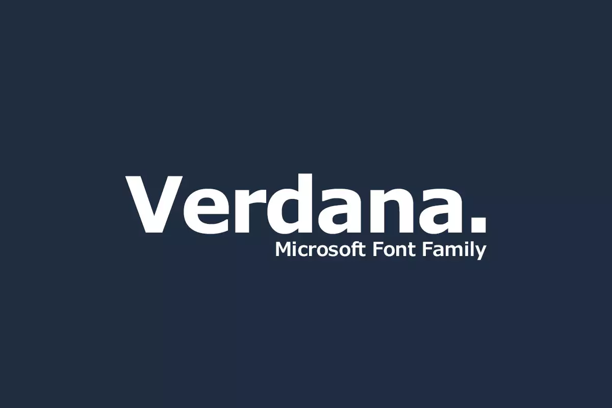
Verdana is an example of a humanist sans serif font family that has been developed with a focus on web compatibility. Created by Matthew Carter for Microsoft, it gained popularity for clean, unobstructed shapes and large letters’ kerning. Although it might be hard to imagine today, Verdana was a major innovation in type design that was specifically created for the constraints of early computer screens.
History
It was in the mid-1990s, when the graphical user interfaces and the internet became popular, there was a requirement for fonts that exhibited good legibility on the lower resolutions screens. Microsoft’s typography team, led by Virginia Howlett, was looking for a solution to this problem. Matthew Carter, a type designer of high repute, was responsible for the design and development of the typeface, and Thomas Rickner from Monotype provided his valuable input by hand, hinting at the better display of text on the screen.
Created in 1996 at the same time with Microsoft Internet Explorer 3, Verdana became very popular in the world of the Web. Of course, the clean, readable font used in the design was a welcome change from the spiky, low-resolution fonts that defined so many early websites. This made Verdana a standard system font for Windows operating systems, therefore increasing its usage in digital text.
Features of Verdana Font
Large x-height for Instant Recognition:
One of the characteristics of Verdana is that it has a large x-height. This means the capital height of x, a, o and such like; by making these letters taller than the ascenders, like the stem of b or d and the descenders, like the tail of p or q, Verdana enhances the legibility. At such sizes, it is possible to distinguish individual letters, and they do not merge into one large
word or a chain of words.
Wide Letter Spacing:
Verdana is more open in terms of the spacing between characters. This relatively large letter spacing, especially in the lowercase, helps to alleviate the issue of letters ‘fusing’ on the lower-density screens. There is good white space around each character, which is beneficial for the reader as the text does not strain the eyes when reading for extended periods of time.
Open Counters and Apertures for Clarity:
The counters or the holes inside letters such as ‘o’ or ‘p’ and apertures or the semi-openings such as the top of ‘c’ or ‘e’ in Verdana are large and unobstructed. This intentional design decision helps to maintain the legibility of the letterforms and avoids the characters bleeding together, which can be particularly problematic when displayed on screens where pixels can create a blurred effect.
Unique Letterforms:
Verdana makes a special effort to distinguish between similar characters that might be easily mistaken. For example, the lower case ‘i’ and ‘l’ have different serifs at their bottoms to prevent confusion, as do the upper case ‘I’ and the numeral ‘1. The changes are minute, but they assist in reducing possible sources of confusion that could affect legibility.
Robust Bold Weight for Emphasis:
The Verdana font is particularly striking and is much more pronounced than the standard font one would use in print. This bolder weight of the text makes the text more legible and easily readable, even on screens that are not very high quality or are relatively old, where the contrast could be a problem. It also gives a clear contrast in the design and does not affect the readability of the text.
Usage
When the internet first started to come into existence, Verdana was the font that many web designers loved. It became popular as it provided clear and readable text to different screen sizes, therefore being ideal for websites. Whether it was the headlines, the body text, the menu bar, or the small print, Verdana always made it easy to read and understand information no matter the device being used. Web design has changed over time, yet Verdana continues to be a safe choice, especially when readability is a major concern.
Due to its high legibility, Verdana was ideal for use in user interfaces. Microsoft incorporated Verdana into its Windows operating systems and used it for menus, dialogue boxes, and other on-screen features. This helped users differentiate between various components of the software applications and did not strain their eyes, thus improving the overall user experience.
Verdan became popular not only for website and UI design but remained an essential font for numerous digital documents. From emails and online articles to e-books and business presentations, its clean and easily readable letterforms and generous spacing made it ideal for text. In the context of digital publishing, Verdana played its part in making sure that people could enjoy reading without having to squint their eyes to make out the text on the screen.
Similar Fonts to Verdana Font
In the Humanist sans-serifs, Verdana is in good company with many other typefaces that are also committed to the principles of legibility. Some of the most popular fonts include Frutiger, which is a design classic, and Trebuchet MS, which is a more playful Microsoft font. The closest font in the Microsoft font family to Tahoma is Calibri, although the latter is slightly wider in form. Expanding the search outside the realm of Microsoft, one can find other fonts such as Open Sans, Roboto, Segoe UI and even the ever-so-popular Arial, which are equally suitable for those who want to find similar fonts to Verdana.
Verdana Font Free Download


FAQ’s
Why was Verdana created?
Microsoft designed Verdana especially for the purpose of improving the legibility of text on computer screens during the early dawn of the Web and GUI interface.
Is Verdana suitable for print?
This particular font is most appropriate for screens; you can also use it for print, but the letters may look somewhat larger than in fonts designed for print.
Is the Verdana font free for anyone to use in their designs?
One of the major advantages of using Verdana is that it comes installed with most Microsoft operating systems and some browsers. If you wish to use it for other purposes, it is possible that you would have to buy a license from Microsoft or the font manufacturer.
Why is Verdana so popular?
A major reason behind the adoption of Verdana is its high legibility on screens, which is ideal for use across a variety of digital platforms.
What’s Included
- Verdana Pro Black Italic
- Verdana Pro Black
- Verdana Pro Bold Italic
- Verdana Pro Bold
- Verdana Pro Cond Black Italic
- Verdana Pro Cond Black
- Verdana Pro Cond Bold Italic
- Verdana Pro Cond Bold
- Verdana Pro Cond Italic
- Verdana Pro Cond Light Italic
- Verdana Pro Cond Light
- Verdana Pro Cond SemiBold Italic
- Verdana Pro Cond SemiBold
- Verdana Pro Cond
- Verdana Pro Italic
- Verdana Pro Light Italic
- Verdana Pro Light
- Verdana Pro Regular
- Verdana Pro SemiBold Italic
- Verdana Pro SemiBold