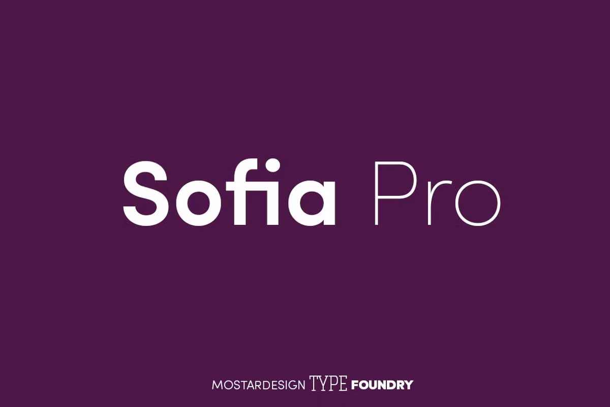
Sofia Pro is a geometric sans font family that dares the modernism and the harmony of the curves. Created in 2009 and completely redesigned in 2012, it has become over time a famous alphabet and has received many accolades from graphic industry professionals. It has exceptionally rounded curves with very open terminals, making this font family elegant, friendly and contemporary. Sofia Pro has been designed with a higher x-height than other fonts to make tiny readability more evident in any use situation. It will be ideal for use in small sizes, such as business cards or mobile applications.
As series of graphic or editorial projects can also use this, Sofia Pro has broad types of weights with 8 styles, (Ultra Light, Extra Light, Light, Regular, Medium, Semi Bold, Bold and Black) with italics corresponding. This is a complete fonts set being the ideal choice for any kind of project including signs, headings, subheadings, editorials, websites, copy for the body, publishing, logos, letterhead, marketing materials, product packaging, and informational inserts. Thus, the curvy and rounded parts of the letters O, Q, a, and e and the open terminations (by C or by G) complete the design of this font, giving a nice rhythm to the long sentences.
History:
Before we dive into the specifics of Sofia Pro Font, let’s take a moment to appreciate the rich history of classic typography. Classic typography refers to the traditional styles and techniques used in typesetting. It dates back to the invention of movable type by Johannes Gutenberg in the 15th century, which revolutionized the printing industry. Classic typography is characterized by its attention to detail, balance, and proportion. Examples of classic typography include serif fonts like Times New Roman and Garamond, which are still widely used today.
Features:
This typeface also has powerful OpenType features to satisfy the most demanding professionals. It has solid features like case sensitivity, trim, true capitals, full ligatures, tabular figures for tables, old-style figures to elegantly insert numbers into your sentences, circled numbers, and more alternative characters to give personality to your projects. This typeface already has a robust home kerning system called “Pro Kerning”. With more than 2500 pairs of glyphs and many languages, Pro Kerning optimizes headlines, subtitles, texts and more in real-time. With all its specificities,
Sofia Pro is a geometric sans that can meet the needs of professionals who want a family of clean geometric fonts, elegant with a wide character set for more than 130 languages of Western Europe, Europe Eastern, Central Europe, Greek and Cyrillic for international communication.
In addition to all the features of its kind, Sofia Pro Condensed is part of a very complete “type system” with style variants such as the condensed version (Sofia Pro Condensed), the soft version (Sofia Soft) or the rough version (Sofia Rough).
With all these typefaces, you have over 40 styles to make your own vibrant and professional graphics or web creations while maintaining consistency.
| Category | Metric |
|---|---|
| Designer | Olivier Gourvat |
| Year | 2012 |
| Classification | Sans-serif |
| Weights | 7 |
| Language Support | Latin, Cyrillic, Greek |
| Usage | Web, Print, Branding |
| Inspiration | The geometric shapes of the city of Sofia, Bulgaria |
Sofia Pro Font Free Download


FAQs
1. What is Sofia Pro Font?
Sofia Pro Font is a modern typeface designed by Olivier Gourvat in 2012. It is a sans-serif font that combines classic typography with contemporary design.
2. What makes Sofia Pro Font unique?
Sofia Pro Font is unique because it has a modern twist on classic typography. It has a clean and elegant design that is easy to read, making it suitable for various applications.
3. What are the features of Sofia Pro Font?
Sofia Pro Font has many features, including a large x-height, open counters, and various weights and styles. It also has a wide range of glyphs and supports multiple languages.
4. Who designed Sofia Pro Font?
Sofia Pro Font was designed by Olivier Gourvat in 2012. It was inspired by classic typography and was intended to be a modern interpretation of traditional typefaces.
5. What are some fonts similar to Sofia Pro?
Fonts that share similarities with Sofia Pro include Avenir, Proxima Nova, Gotham, Montserrat, and Lato.


