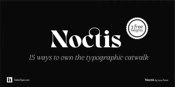
Noctis was originally born as a single weight display typeface, designed by Luca Terzo who took inspiration by the unusual wedge serifs of Aldo Novarese’s 1972 typeface for H. Berthold A.G., Primate. The design was developed by the Italian Type team into a full family of five weights from thin, each with its own true italic, and with a complementary set of decorative patterns.
The strong Didonesque contrasts make this typeface both impressive at display sizes and easily readable in text size. At the same time, the sharp shapes of the triangular serifs and the distinctive letter shapes show their strength in logo design and impressive editorial use. Inspired by the elegant, self-conscious and over-the-top aesthetics of the Italian fashion scene of the eighties and nineties, Noctis finds its strength in its textural solid nature, which is explored in the Noctis Texturae subfamily, where each letter is used as a tile to produce seamless patterns that can be utilized to extend the branding capabilities of Noctis.
Noctis features an extended Latin character set of 481 glyphs covering over 190 languages and includes advanced open-type features like standard and discretionary ligatures, positional numerals, stylistic alternates, and case-sensitive brackets. Mixing versatility and personality, Noctis is ready to be like a top model on the design catwalk, making your projects look classic but contemporary, finely tuned but assertive, and elegant as the best Italian luxury fashion.
Noctis Font Free Download


