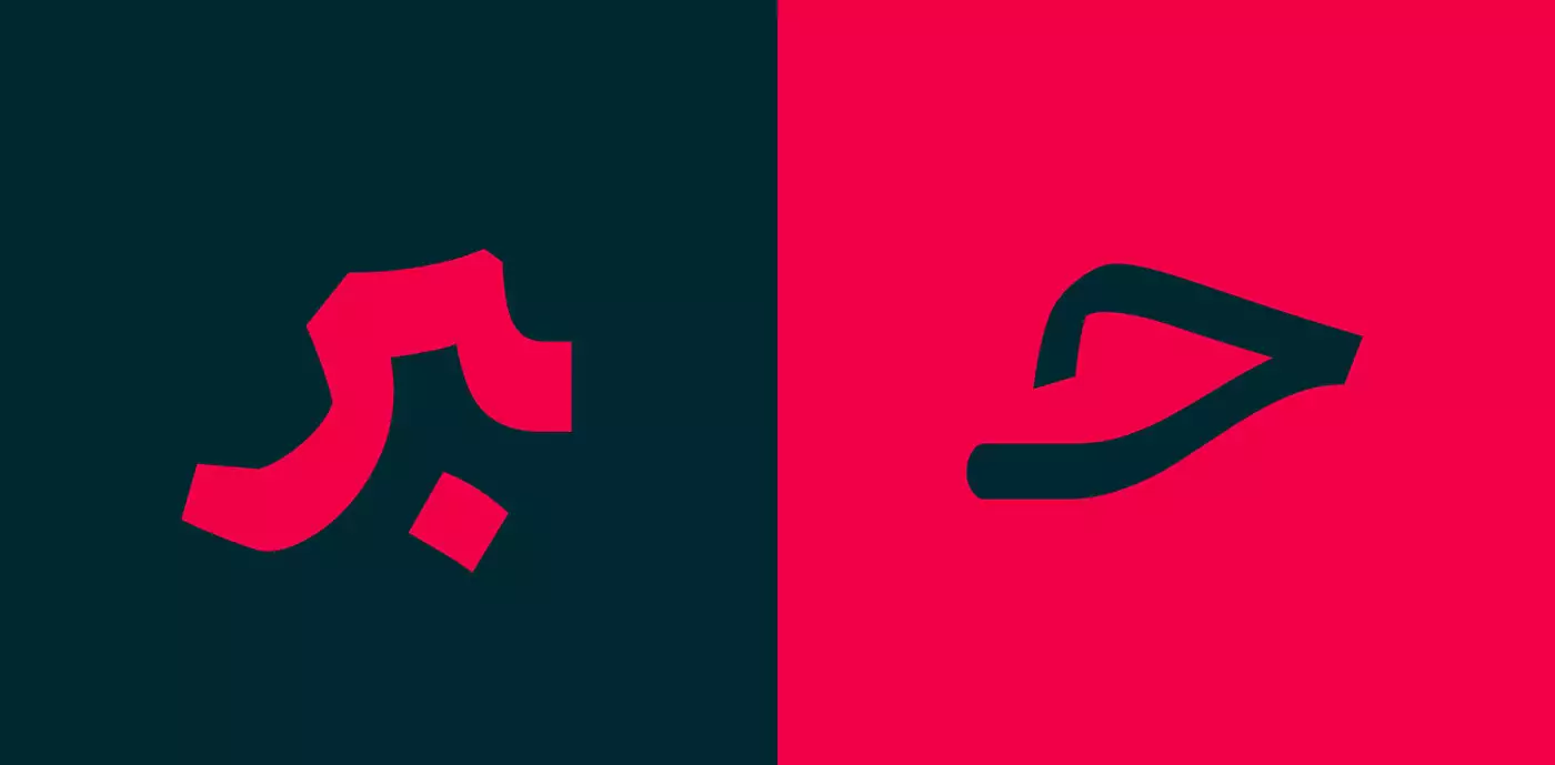
The Nian* typeface designing was focused on legibility, so it would cover other modern font’s defects, which are used for general text writings. While being modern and up to date, the typeface’s original spirit is still there. Nian is a strong typeface with a clear structure, and because of these features, more flatten forms and joints can be seen. Nian has 8 weights. The basic weights are suitable for long texts of books and magazines, and the light and bold weights are good for graphic designs and advertising. Not to mention this font supports Farsi, Arabic, Urdu, Kurdish, and Jawi languages.
Nian typeface design started in 2011. It changed gradually and completed in 2016. Then its weights were designed and completed within two years. This typeface was co-designed by Afsane Salek and me, Reza Bakhtiarifard.