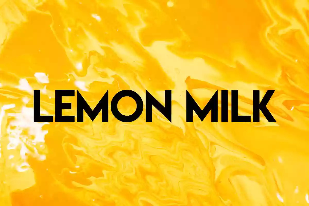
Lemon Milk is a geometric sans serif font family that has found its place in the design society and is admired for its persistent geometric shapes and usage in various fields. Marsnev created this font, which has recently gained popularity among designers because of its simplicity and minimalism. Lemon Milk offers elegance and simplicity, making it suitable for different design applications.
History
Lemon Milk Font was designed by Marsnev, who received much acclaim for his original typeface designs. Due to its introduction and unique geometric shape, it gained quick popularity in the design community. The name “Lemon Milk” is quite unique and creative, which makes it easily memorable for clients.
At first, Lemon Milk was released as a free font, which made it accessible to a vast number of designers who could test it without having to spend any money. This accessibility was one of the factors contributing to the general use of this format. As Marsnev’s font gained popularity and more people wanted more features, he released the professional version called Lemon Milk Pro, which has a larger character set, more weights, and other stylistic accents.
Features
The design of Lemon Milk is quite unique and one of the most appealing features of the font. All the shapes of the letter are constructed with clear, precise forms and equal distribution of the elements, which gives the typeface a contemporary look. The geometric consistency helps to maintain the aesthetics of the font and makes it easily legible for different uses.
Lemon Milk also comes in a variety of weights from the light ones to the bold ones. This spectrum offers designers the possibility to employ the font for various tasks, including headings, logos, and texts. However, the font retains its unique characteristics regarding the weight to provide uniformity within a project.
The Pro version of the font Lemon Milk has an expanded character set, which allows for the use of multiple languages. This is particularly useful in global projects as designers can easily maintain the typography across various languages and even alphabets.
However, Lemon Milk Pro also includes more stylistic bases, which will enhance the creativity of designers. You can use these alternatives to complement certain projects to increase the versatility of the font.
Usage of Lemon Milk Font
This font is perfect for logos and branding due to its strong yet minimalist design with sharp edges. Its design looks very formal and business-like, which would be perfect for companies that wish to convey a more progressive image. The range of weights also allows designers to create a brand identity system where different weights are in use for different aspects of the brand, like logos, business cards, and other promotional materials.
In the print media, Lemon Milk is better because of the ease of reading and understanding the content. The font has a geometric look which makes it easily readable even at smaller sizes which therefore makes it suitable for use in magazines, brochures, posters and other print materials. It is possible to distinguish headlines and subheadings by making them bold while body texts will be in lighter weights which will create a feeling of hierarchy.
Thus, Lemon Milk is perfectly applicable for web designs and can improve the look of websites. Its contemporary design is perfect for the tech industry, new businesses, and design studios that aim to exhibit the philosophy of innovation. The font’s legibility makes it suitable for use on screens, making it useful on both desktop and mobile platforms to enhance the usability experience.
Lemon Milk makes use of design in advertisement and marketing in a way that will definitely gain much attention. In advertisements, on social media platforms, and in emails, the font choice is strong enough to draw attention to important details that will help capture the recipient’s interest.
Similar Fonts to Lemon Milk Font
Futura: Futura is a well known geometric sans-serif typeface designed by Paul Renner in 1927. Similar to Lemon Milk, Futura also has a simple, geometric shape and proportional composition, which makes it suitable for branding, or editorial design, and many other purposes.
Avenir: Another geometric sans-serif typeface similar to Lemon Milk is Avenir designed by Adrian Frutiger. Lemon Milk’s design is a bit more mechanical, giving off a colder and more corporate vibe while Avenir is slightly more humanistic, giving off a warmer and more inviting feel without losing the geometric aspect of it.
Montserrat: Montserrat created by Julieta Ulanovsky is a modern and clean sans-serif font with geometric appearance comparing to Lemon Milk. Montserrat is a popular font for websites and logos as it has a contemporary and flexible design.
Gotham: Gotham is a font by Tobias Frere-Jones and is well-recognized for its simple and up-to-date look. It has the same aggressive style of Lemon Milk, so it is suitable for different tasks and projects.
Bebas Neue: Bebas Neue from Ryoichi Tsunekawa features a bold and condensed characteristic that is quite similar to the heavier weights of lemon milk. It is mostly utilized for headlines and promotional text as it has a stunning appearance.
What’s Included
- Lemon Milk Light
- Lemon Milk Light Italic
- Lemon Milk Regular
- Lemon Milk Regular Italic
- Lemon Milk Bold
- Lemon Milk Bold Italic
Lemon Milk Font Free Download


FAQ’s
What makes Lemon Milk unique?
It has a unique geometric design and a modern look that makes it be easily noticeable from the rest. Its simple and elegant design with proper ratio and harmony in the typography makes it suitable to use in any design work.
Is Lemon Milk free to use?
Lemon Milk font is free in its original version, which makes it suitable for different users. However, the pro version, Lemon Milk Pro, which contains extended character set and stylistic sets, is a paid font.
What are some popular uses of Lemon Milk?
Lemon Milk is popular in branding and logo design, print media, web design, advertising, marketing, and editorial design. Its versatility and modern look make it suitable for a wide range of applications.
How does Lemon Milk compare to other geometric fonts?
As we have seen, Lemon Milk is quite similar to other geometric fonts such as Futura, Avenir, Montserrat, Gotham, and Bebas Neue. However, it stands out with its combined daring and sharp angles, which give it a different look.
How can I pair Lemon Milk with other fonts?
Lemon Milk goes well with other fonts that have no serifs and have a design that is similar to the geometric style of the font. You can also combine it with serif fonts to give a harmonized contrast in the design and make it look more attractive.