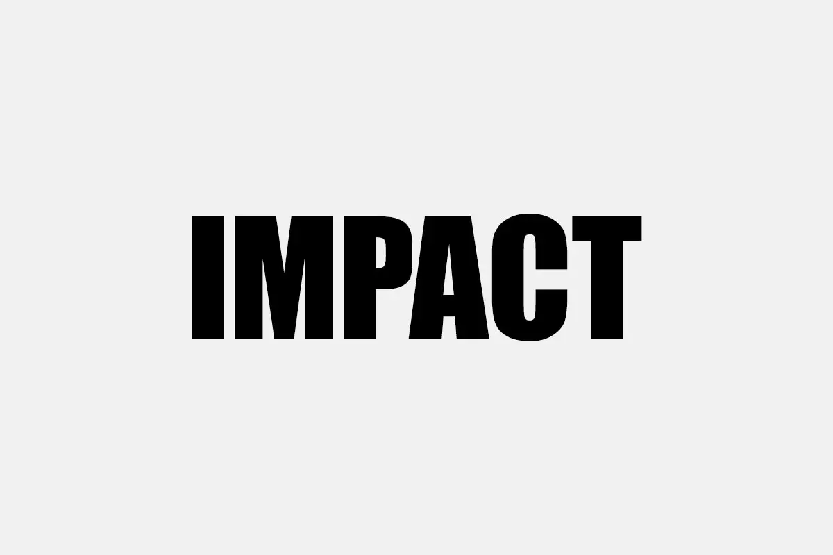
Impact, a sans serif meme font designed by Geoffrey Lee in 1965, has recently emerged as one of the most recognizable elements of graphic design and the Internet. Its large, square shapes are hard to miss, so it is used frequently in headings, banners, and memes. Although it was initially used in conventional print design, the contemporary popularity of Impact can be attributed to its widespread application on the Internet.
The Evolution of Impact Font in the World of Typography
The mid-1960s marked a shift in both the culture and terrain of graphic design and marketing. The design culture craved the new and rejected the old styles that represented the America of the 1950s. The aesthetic of the previous decade, which was more often associated with the colours, festivity, and cheerfulness of advertisements, had become outdated.
On the other hand, the culture at the time and the advent of post-modernism called for a revolutionary change in graphic design and typography. The advertisements became more serious and staid, and the focus shifted from the visualization of the message to the message itself. The strong, condensed and sans serif became the new norm, thus defining a new, cleaner and more organized age of design. This design philosophy not only appealed to a more mature market but also frequently changed the focus from the family to the person.
The 1990s marked the beginning of the personal computer revolution, and with it came an abundance of digitized fonts. Among them was the ever-present Impact font, included in every version of Windows. This use, together with other aesthetic fonts like Times New Roman and Courier, revolutionized the display in digital design. The once liberal forms and freedom of creative thinking in design got limited and shaped by the digital world, giving birth to a new playground with rules yet full of possibilities.
Features
The most obvious characteristic of Impact font is that it is bold. The bold lines of each letter require focus, which makes it suitable for titles and other display fonts that require emphasis. This is coupled with the lettering, where the letters are close together, and the overall design looks quite crowded.
The other feature that is characteristic of the design is the absence of interior counter forms to a greater extent. The counters of letters and the interior of the letters, like in o or p, are rather small, which enhances the thick structure of the strokes and the general boldness of the typeface. Impact also has a high x-height, which means that its lowercase letters are very tall and are almost as tall as the capital letters. This makes the text easy to read, especially in bigger sizes, and imparts a unique style to the font.
Moreover, Impact has a low x-height and short ascenders and descenders, as well as the upper and lower extensions of the letter forms. This gives the font a neat and tidy appearance owing to the compact and uniform look of the font. However, since it is rather bold, Impact is not very suitable for smaller sizes, but it can be very effective in advertising and even in internet memes. Because it is simple in design, it is universally comprehensible regardless of culture or language, and it is still an effective font to this day.
Impact as a Meme Font
Impact as a font is bold and has a consistent look. First and foremost, it is rather simple to automate the process. It is interesting to note that memes are the main reason behind the popularity of Impact not just because it is a short and bold font, but because it is easy to utilize across all our digital platforms. As for the integration issue, it is not a problem for meme generator websites because Impact has been popular among Microsoft and other companies’ fonts for 30 years.
Impact was not the preferred font for the memes in the macro image format; it was just readily available for repeating patterns. It became the cultural reference for memes through its constant repetition. The top text and bottom text formats of memes are perfect for what pre-ironic meme culture requires. The bold headline typeface helped to stress and structure the punchlines or concepts that a meme intended to convey.

If we switch the font of this meme, it will look weird. This might be due to the fact that we are used to it, but if we step back and look at it from the perspective of not having seen it for years, the Impact font, the namesake of the movie, is one of the best fonts for memes, or at least bold and condensed headline fonts are. Impact’s footprint is modest, and in the world of memes, where things come and go in the blink of an eye, details and decisions matter. At times, I can try to write or preach about the influence of Impact here, but the fact remains that Impact will go on living only because it needs to, just like me and you. It is only dead when no one remembers it.
Usage
Headlines
Due to the strong emphasis that Impact provides, it can be a very useful font for designers and communicators. It is a highly flexible format that can accommodate powerful headlines in different formats ranging from print magazines and newspapers to online platforms. It is most useful in cases where there is little room for maneuver as it is able to pass on information with speed.
Posters
In terms of advertising and signage, Impact’s prominence is an advantage. Whether on a poster, a billboard or even an online banner, its big, square-shaped letters guarantee that the message will be noticed and read. This makes it ideal for use in making attention-grabbing announcements and calls to action.
Memes
The appearance of Impact has also given it cultural significance in the new age of digital media. It has become internet slang, with the letters written in capital letters and placed on images, conveying humour, satire, and social critique. This has created a space for it to become popular in the online culture.
Logos
Some of the brands have even decided to use Impact in their logos, capitalizing on the fact that it is a strong and easily recognizable typeface. Still, since Impact is hardly the best choice for every brand, it can be useful for those who want a powerful and striking brand image.
Fonts Similar to Impact
Several fonts share similar characteristics with Impact
Haettenschweiler: A strong, compressed sans serif typeface with similar characteristics to Impact in the 1960s.
Verdana: A condensed sans-serif font with a similarly bold look to the previous font.
Poppin: A clean and contemporary sans-serif typeface with a touch of whimsical curve.
The following are fonts that designers can use to achieve a look similar to Impact.
Impact Font Free Download


FAQ’s
Who created Impact font?
Impact was created by Geoffrey Lee in the year 1965 for the Stephenson Blake type foundry.
Is the Impact font available for free?
Yes, Impact is pre installed in operating systems and it is available for both personal and business use free of charge.
What makes the Impact font so popular in memes?
Due to its clear and simple font, it is perfect for adding text over images. It became a meme font because of its prevalence in early internet culture.
Is it a good idea to use Impact for body text?
Although feasible, it is not advisable to use Impact for large swaths of text as it becomes difficult to read when scaled down. It is most appropriate for headlines and slogans.
What is the Meme Font
There are many fonts to make memes; however, due to the popularity of Impact font for the meme creators. It is is perhaps the most iconic of them all.
Impact as font meme remained relevant across many generations of technology as a unit even though it had limited use in the design industry. It is not many fonts that will go through such an exciting life of their own and spread themselves about as Impact does. Although people most commonly link this particular font with the pre-ironic meme, in the post-ironic and meta-ironic meme. Many people who use the internet often use Impact font meme to make their posts, comments or other online content more humorous.


