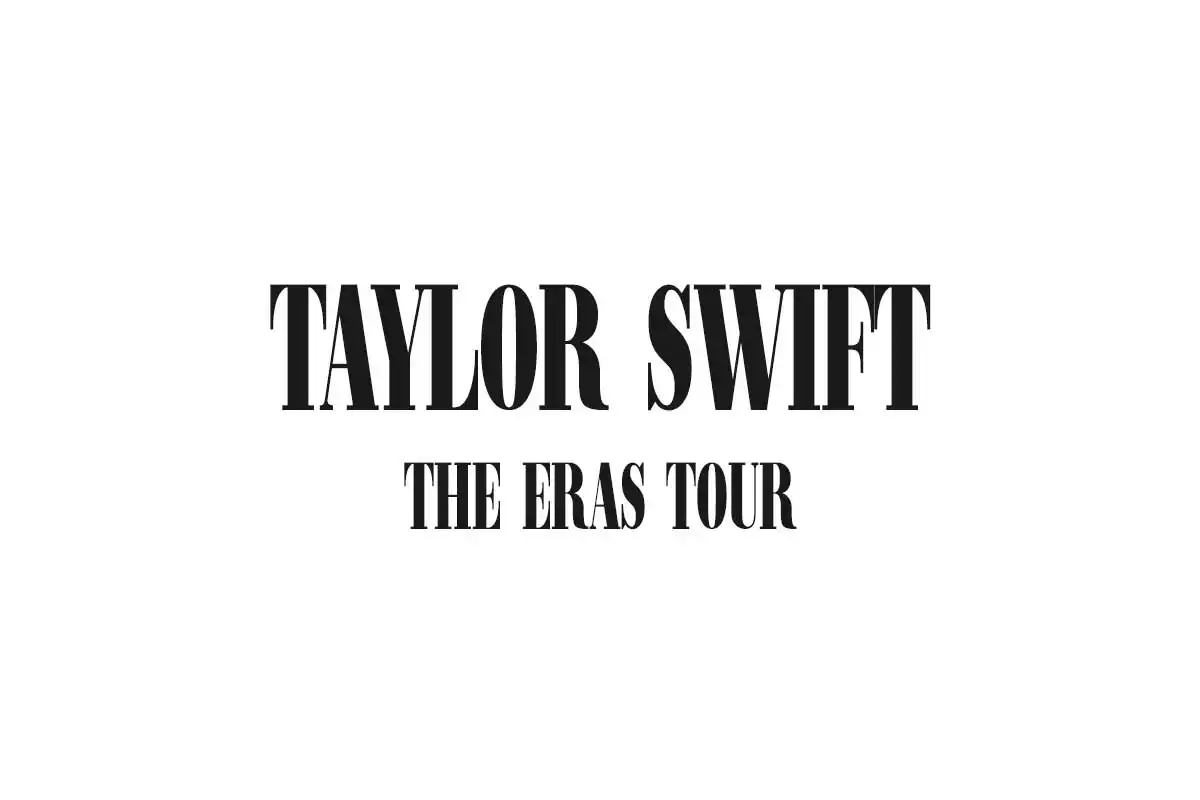
The Taylor Swift Eras Tour Font is a typographic symbolization that refers to Taylor Swift’s different musical eras and tours. As an artist famous for her artistic precision and branding, Taylor Swift frequently employs apt typography to brand her album releases and concert tours. This results in creating a coherent visual identity that connects with her fans.
In her music career, Taylor Swift has employed different fonts and design features in her albums and tours. These design elements reflect the evolution and transformation of her music. For instance, the album “Fearless” featured elegant, handwritten fonts, while “Reputation” had a bold and edgy style. Swift’s typography choices have been instrumental in creating visual narratives that complement her music.
The Eras Tour Font can change according to the era or tour it’s meant. For example:
Fearless Era ( Fearless Taylor Swift Font)
In the “Fearless” era, Swift’s transition from country to pop music, the fonts were sometimes very delicate and whimsical, which made them capable of reflecting the young and innocent nature of her early songs and the romantic themes.
Speak Now Era (Speak Now Font)
The typography of “Speak Now” relies on vintage-influenced fonts in collaboration with ornate flourishes to conceptually reflect the songwriting style, which is narrative.
Red Era (Red Taylor Swift Font)
Red witnessed some style transformation compared to the previous albums, where different genres of music and a wide range of emotions were expressed through bolder and catchier fonts.
1989 World Tour (1989 Taylor Swift Font)
The typeface for the 1989 world tour was drawn using a minimalistic style with some inspiration from retro elements and 80s pop culture so that the album and tour could come together.
Reputation Era (Reputation Taylor Swift Font)
During her “Reputation” era, Swift had what looked like a structural rebirth. She somehow managed to look scary and inviting at the same time. That was visible in the choice of typography – bold, edgy fonts with slight grit attempted to feature attitude and rebelliousness.
Lover Era (Lover Taylor Swift Font)
The typography of “Lover” was a comeback to a more relaxed and light-hearted font, using pastel colours and romantic fonts that made sense of romantic nostalgia.
Mignights Era (Midnights Taylor Swift Font)
Taylor Swift’s new era, “Midnights”, began with the empowering album “Reputation.” Swift depicted a transformation from her teen pop style to a more melancholy persona that came into life in her music and the aesthetic elements that were part of her creative work.
Folklore and Evermore Eras
From folklore to evermore, Swift’s latest albums have reintroduced, through the piano, the typographical aesthetic of intimate and contemplative music.
In these periods, Taylor Swift has shown that she possesses an excellent gift for typography. She uses it to shape her artistic identity and connect visually with fans. With the reasonable choice of typefaces that echo the mood and spirit of her music, Swift has not only unified but also generated a unique, visually striking brand identity that hits home with her audience worldwide.
Eras Tour Font Free Download