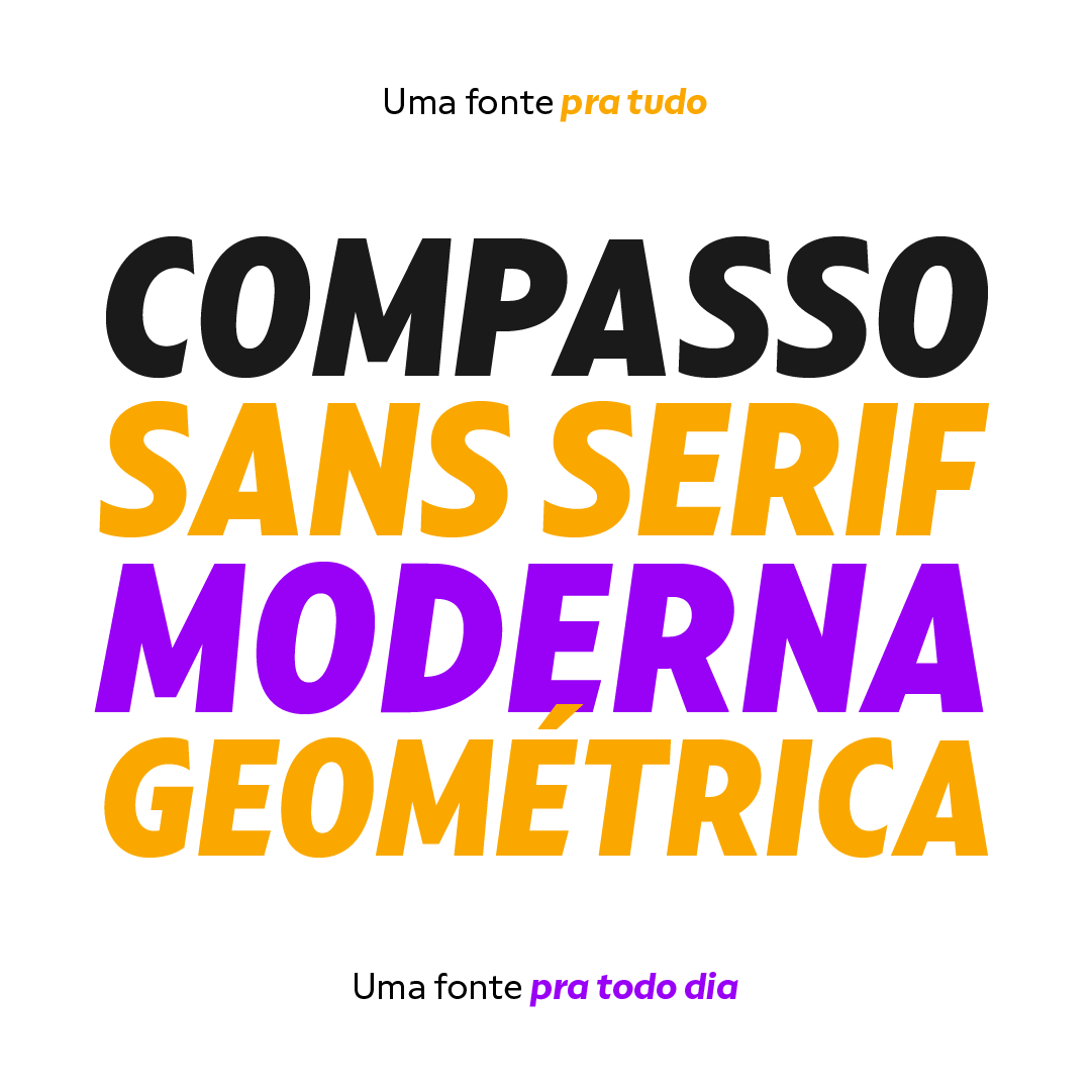
The idea that mathematical precision and the supposed “purity” of geometric forms are part of the discourse of us graphic designers is not new. Studying typography for some time now and learning about all the small alterations and adjustments that this geometry undergoes to better adapt to the imperfect human eye, I found myself with a new way of seeing things.
Compasso is, in a way, a result of my growth as a designer. Established and recognized fonts like Futura, Avenir, and their predecessors (including Tempo – published by the Ludlow foundry in the early 20th century) informed the result of Compasso at some level. Others opened my mind to possibilities. Mallory, Azo Sans, the font designed for Audi by Bold Monday, and many other contemporary sans-serif fonts that left me speechless are also responsible for details present in this font.
From the first sketch, the family grew on both sides, gaining condensed and extended counterparts. From there – and from a brilliant insight from designer Nicole Rauen – I learned that Compasso was not about geometry. Compasso is about rhythm. It’s about the rhythmic movement that provides a foundation, supports, and also makes you dance and swing.
My musical taste is too eclectic, I can go from classical to funk in less than two songs on Spotify. Compasso is also eclectic. It’s a font to take your project anywhere, a record to listen to on any occasion.
Font Preview


