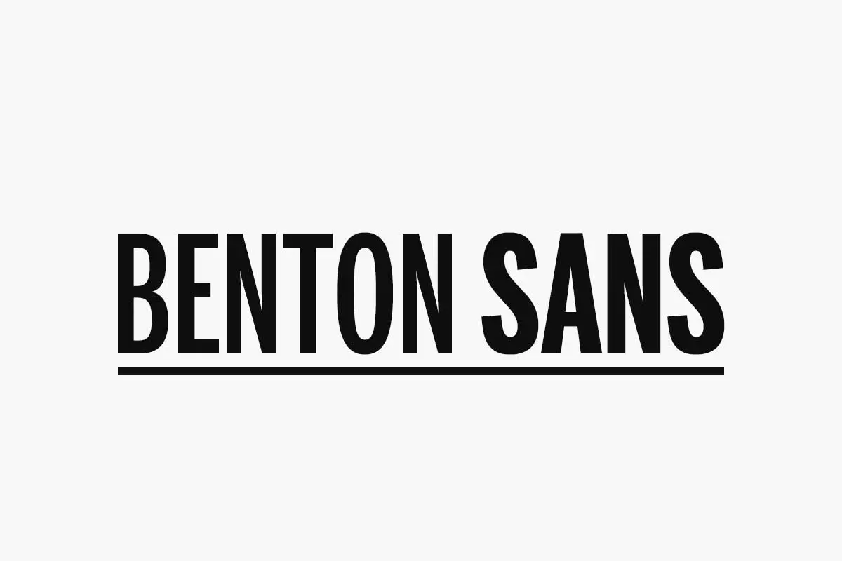
Benton Sans is a commercial font designed by Tobias Frere-Jones in 1995. It is an original interpretation of Morris Fuller Benton’s Franklin Gothic, a traditional plain typeface created in the United States in the early twentieth century. Benton Sans embraces a modernist design, drawing inspiration from Franklin Gothic with extensive use of geometric shapes and lines. The typeface was given Benton’s name in honour of his effort towards developing American typography.
Later, Cyrus Highsmith, a type designer and senior typeface designer at the Font Bureau developed and extended some of them. Highsmith has attempted to optimize Benton Sans for new media use and again for use on the internet to give the typeface a contemporary feel in the design world. Based on these developments, Benton Sans keeps its functional and aesthetic uses in other areas of design, thus cementing its place in the design arsenal.
Versatility of Benton Sans Font in Design
Benton Sans typeface provides an extensive array of weights and styles, from thin to thicker or bolder forms, which allows designers to highlight or arrange the hierarchy in their designs. It is, however, worth noting that, in addition to being offered in regular width, Benton Sans web font comes in italic and condensed styles as well, answering even more designers’ needs.
Depending on the type of design that a person is involved in, Benton Sans can come in handy because of its versatility. It is the epitome of simplicity and functionality; thus, it is employed frequently in editorial design since readability is crucial in this context. Furthermore, Benton Sans is a perfect choice to use in branding and packaging projects mainly because of its abilities to cover a variety of styles as well as create unified and strong-looking brand images.
Design Characteristics
Benton Sans is famous for its geometric construction, easily recognizable curves, and obvious concept of clear opening. The letterforms are not extremely narrow; in fact, they are fairly wide and with ample x-height. Therefore, they do not strain the eyes when shrunk down to a smaller size. Lowercase a and g are rounded, referring to the typeface’s history as well.
One of Benton Sans’s benefits is that it is quite generic. These are Thin and black-weight typefaces with Italic styles to complement the selected weight. This implies that designers can take different typographic communication approaches, from simple and highly sophisticated to rough and proactive. It is also available in condensed, compressed, and extra-compressed widths, so the designer is spoilt for choice even more!
Usage of Benton Sans Font
Benton Sans is versatile and useful for many areas of design, such as branding, editorial, web, vehicle, building signage, etc. Graphic designers widely use it because of its excellence in display and print, as the letters are clearly distinguishable when written in this typeface. In corporate identity, many companies have applied Benton Sans, like Martha Stewart Living Omnimedia, commissioned Benton Sans and incorporated it into their brand design. The absence of ornaments and excessive use of colours also signal the formal nature of the design, as it is suitable for companies willing to represent the image of a modern and successful company.
The typography used in editorial design includes Benton Sans for headlines, subheads, and body text. Its punctual design and numerous weights lend themselves well to any form of publishing media, including magazines, newspapers, books and brochures. As it is well established, Benton Sans is often used for headlines, navigation elements, and body copy on the web. It has a deliberate font, and the text looks crisp on-screen, even when creating small letters or icons. Benton Sans is also widely used in signage. Benton Sans’ design excels in large-format applications like billboards and hoardings, ensuring clear communication from afar.
Influence of Benton Sans over Typography
Benton Sans still finds its place among the works and creations of modern typeface designers and engravers, proving its relevance and usefulness in the modern world. Another advantage of Benton Sans is its flexibility, which means it remains relevant to date and does not lag behind new tendencies and technologies. Another sign of the typeface’s legacy lies in its usage throughout the various printed materials used today. Some examples are brands, publications, and websites where people use Benton Sans today. It effectively transmits its message and can be understood by the targeted audiences worldwide regardless of societal order.
What’s Included
- Benton Sans Thin
- Benton Sans Extra Light
- Benton Sans Light
- Benton Sans Medium
- Benton Sans Regular
- Benton Sans Bold
- Benton Sans Black
- Benton Sans Book
- Benton Sans Condensed Light
- Benton Sans Condensed Medium
- Benton Sans Condensed Regular
- Benton Sans Condensed Bold
- Benton Sans Condensed Black
- Benton Sans Condensed Book
- Benton Sans Compressed Light
- Benton Sans Compressed Medium
- Benton Sans Compressed Regular
- Benton Sans Compressed Bold
- Benton Sans Compressed Black
- Benton Sans Compressed Book
- Benton Sans Extra Compressed Light
- Benton Sans Extra Compressed Medium
- Benton Sans Extra Compressed Regular
- Benton Sans Extra Compressed Bold
- Benton Sans Extra Compressed Black
- Benton Sans Extra Compressed Book
Benton Sans Font Free Download


This typeface shows that simple geometric shapes in interaction with each other can create wonderfully appealing characters in contemporary typography even today. Due to its simple-minded arrangement, geometrical design and distribution in medium to heavy weights, many enterprises widely use it. In its application of corporate branding, publication design, web work, and signage, Benton Sans is a font of business communication with a professional and sleek design. The credit goes to the creation of Morris Fuller Benton and as a tribute to the everlasting desire of the fine art of basic designs, Benton Sans serves as a typeface that not only enthrals the designers but also the audiences.
FAQ’s
What is Benton Sans font?
Benton Sans is a typeface designed by Tobias Frere-Jones in 1995. It is a universally and neatly constructed sans-serif, as this font frequently appears in contemporary design projects.
Why does Benton Sans remain popular among the designers?
Benton Sans typeface is easily recognizable and widely used by designers due to its clarity and simplicity for various kinds of projects. It is also easy on the eye and very readable and this has seen it being used widely in print and electronic media.
What are the common uses of Benton Sans Font?
Benton Sans can be applicable to different designs such as branding designs, editorial designs, web designs, and adverts. It is also commonly applied to signs and signage systems because it has a clean, easy-to-read design.
Is Benton Sans font available in different weights and styles?
Yes, Benton Sans font family consists of regular, bold, italic and condensed styles. This means that the designers can employ the font in many different design related tasks so as to establish proper hierarchy in the design.
What are some fonts similar to Benton Sans?
Several fonts offer a similar aesthetic and versatility to Benton Sans: such as Helvetica Neue, Avenir, News Cycle, Libre Franklin, Proxima Nova, and Roboto are all fonts that share similarities with Benton Sans.