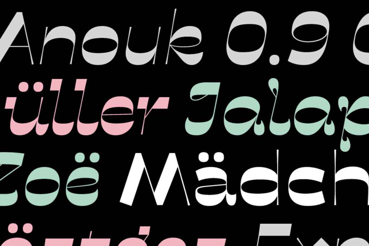
Anouk is a reversed high contrast typeface designed to be used at large sizes.
Its design was conceived by Sabina Chipara at Acute Studio. The design started with her writing letters with a soft brush-marker. The emphasis of the ‘normal’ letter-contrast changed, and the thin lines became very thick, while the thick ones became thin.
The design started by writing letters with a soft brush-marker. The emphasis of the contrast changed and the thin lines became very thick, while the thick ones became thin and splayed at the ends to remind of the tool that was used to draw them.
Unlike most other type families that have one italic weight, Anouk has three different italic styles, each with a different voice: a slanted italic version that draws inspiration from the original upright shapes, a square italic version with many straight lines and edgy feel, and a curly italic version with decorative loopy elements.
As usual, we are looking for your comments, critique, and suggestions.