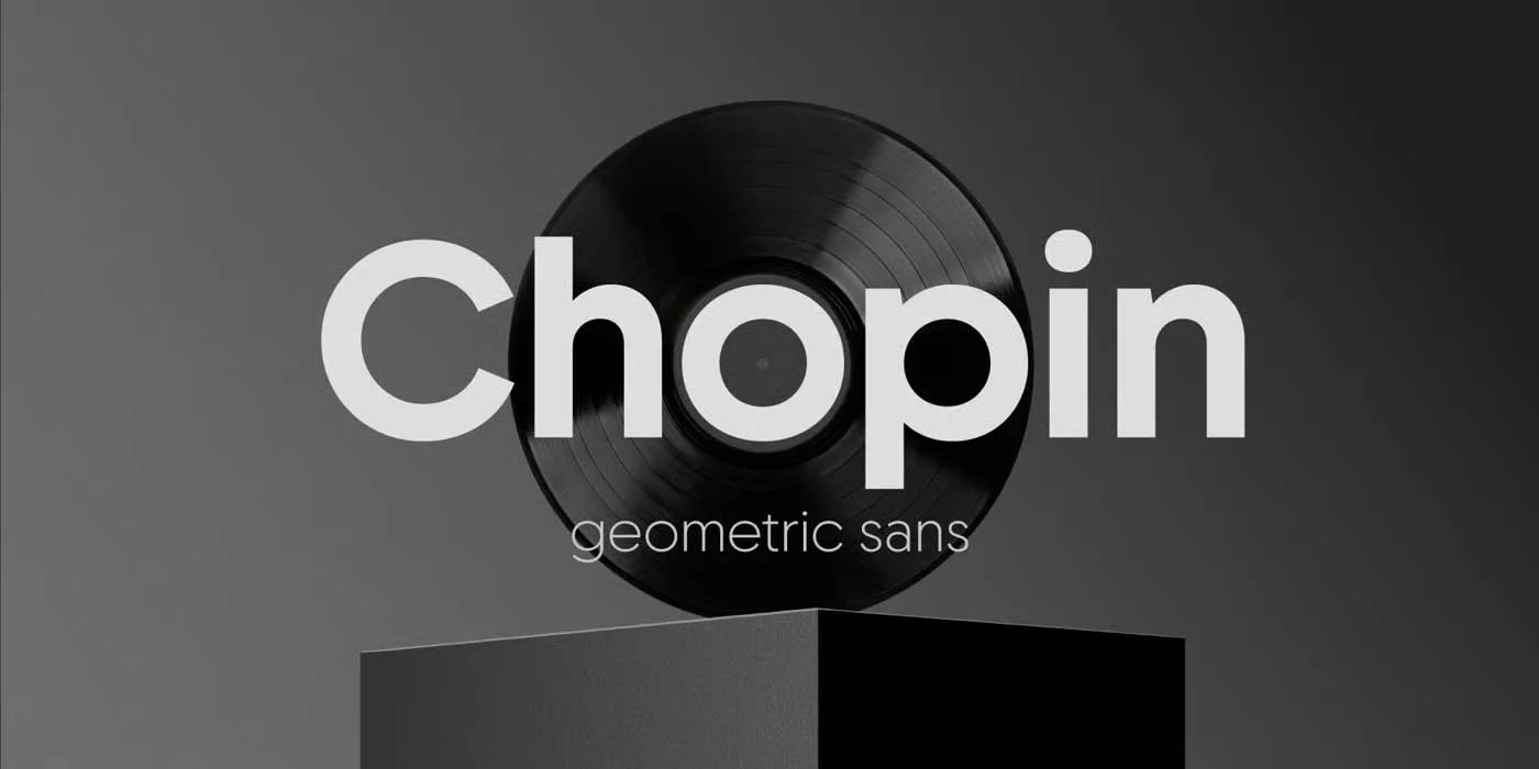
Chopin is a geometric sans-serif font that gives off a mood of personality, activity, and movement. Designed by the talented Svetoslav Simov, the author of many popular sans-serif fonts. Chopin has evolved as a preferred font among designers who want to use a font that is expressive and at the same time, highly legible.
History
The initial concept is attributed to Svetoslav Simov, who was influenced by historical posters and book titles. Simov, the founder of Fontfabric, has extended these elements to incorporate the prevailing tendencies and styles of contemporary design. Viktoria Usmanova, as the Type Director, also contributed to the refinement of the typeface to make it look even better. This process created a typeface that has both the characteristics of traditional typography and the features of the contemporary world, the face of the city.
The brand’s name is taken from the great Polish virtuoso performer and composer Frederic Chopin, whose music is filled with passion, professionalism, and innovation. Similarly, the creators of the Chopin typeface wanted to give it a meaning and identity of freedom and creativity.
Features
Chopin’s design is more based on geometric shapes, rhythmic arrangements of letters, and very wide and very narrow proportions. These features establish a visual beat that is unique to Chopin and distinguishes it from the general group of sans serif typefaces. The lettering of the typeface is strong and carries a certain energy with it, having rounded shapes and pointed edges.
Chopin includes complete support for extended Latin, Cyrillic, and Greek character sets, which makes it a versatile font for many globalization projects. The font has a full range of weights from Hairline to Black to ensure flexibility of use across various designs. Also, Chopin has a number of stylistic options, ligatures, and case-sensitive forms, which gives the designers much freedom for their creativity.
Usage
Chopin can be best described as a versatile font since it has many applications in both digital and physical designs. This is due to its willingness and the ability to convey information in headlines, titles, and short phrases. The typeface also works great for logos, posters, and packaging due to its rhythm and character.
In the digital world, the excellent readability of Chopin guarantees a comfortable reading experience on any device. That is why it is suitable for web and mobile application development, and the dynamic nature of the type can become an advantage in the interaction with the user. The fact that Chopin combines historical influences with contemporary design elements has made it a preferred option for logos and advertising.
Similar Fonts to Chopin Font
There are other fonts with geometric sans-serif and dynamic appearance and personality similar to Chopin’s.
Futura: A geometric sans-serif typeface with clear and simple shapes and strong structure.
Avenir: A contemporary Typeface in sans-serif with humanistic characteristics for a more friendly and welcoming look.
Gotham: All time famous geometric sans-serif typeface with a distinct and versatile style.
Montserrat: A geometric sans-serif typeface design with influence from the typography of Buenos Aires’ city.
Chopin Font Free Download