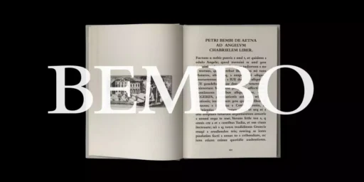
Bembo is a serif font family which has not gone out of style and is famous for its beauty and legibility as well as being a classic font. The British Monotype Corporation designed it in 1929, deriving it from the type that Aldus Manutius employed in Venice in 1495. Francesco Griffo first introduced this classical design for the book “De Aetna” by Pietro Bembo.
History
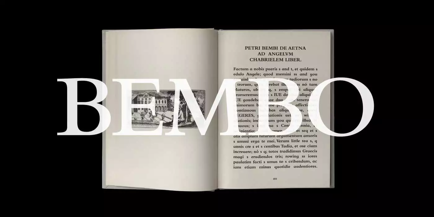
The history of Bembo starts in 1495 when Francesco Griffo, a Venetian punchcutter, created a Roman typeface for the printer Aldus Manutius. This typeface, known as the Aldine Roman, was used in printing Pietro Bembo’s ‘De Aetna’, which tells of Bembo’s journey to Mount Etna. It was elegant and clear and gained popularity in the field of printing books.
In 1929, the Monotype Corporation, under the direction of Stanley Morison, one of the most renowned typographers and printing historians of the period, reissued Griffo’s Aldine Roman for use in modern printing. This revival, named Bembo after Pietro Bembo, attempted to reproduce the idea of the face but modified it to meet the requirements of typesetting in machines and printing. The result was a typeface that kept the qualities of the Aldine Roman as the ultimate model for the book typeface yet provided enhanced legibility as well as greater versatility.
Features
The design has clean lines with excellent proportions and open counters with rather hidden details. The serifs are not too aggressive or severe but also not too gentle; they are moderately bracketed, which means that the font’s design is not limited to purely classical or purely modern aesthetics. Humanist calligraphy inspired the letterforms of the typeface, which makes the typeface look quite friendly.
Bembo offers a wide range of weights, from hairline to black style, compatible for use in both text and display. It also has many variations of the letters, ligatures, and small capitals, which make it versatile. The italic version of Bembo, developed by calligrapher Giovanni Antonio Tagliente in the 16th century, stands out as a notable example.
Usage
The Bembo typeface boasts clear and easy-to-read letters, making it suitable for the body text in books and other printed documents. It has a very aesthetic look and is ideal for headlines, titles, and other display uses.
Bembo is one of the most used fonts on websites, blogs, and eBooks in the digital media platform. Another feature is that it does not have a complex layout with images and counters and is also suitable for mobile screens where the text is easy to read. Bembo is, therefore, suitable for branding and logo design because of its elegance and history.
Similar Fonts to Bembo Font
Thus, Bembo has remained popular and has led to the creation of other fonts with similar designs.
Garamond: A more classical old-style serif typeface with a similar humanistic flavour but slightly more elegant ratios.
Jenson: Another example of the old-style serif typeface is reminiscent of the type design of Nicolas Jenson, the 15th-century printer.
Palatino: A classical serif font is one of the most common fonts due to its readability.
Bembo Font Free Download