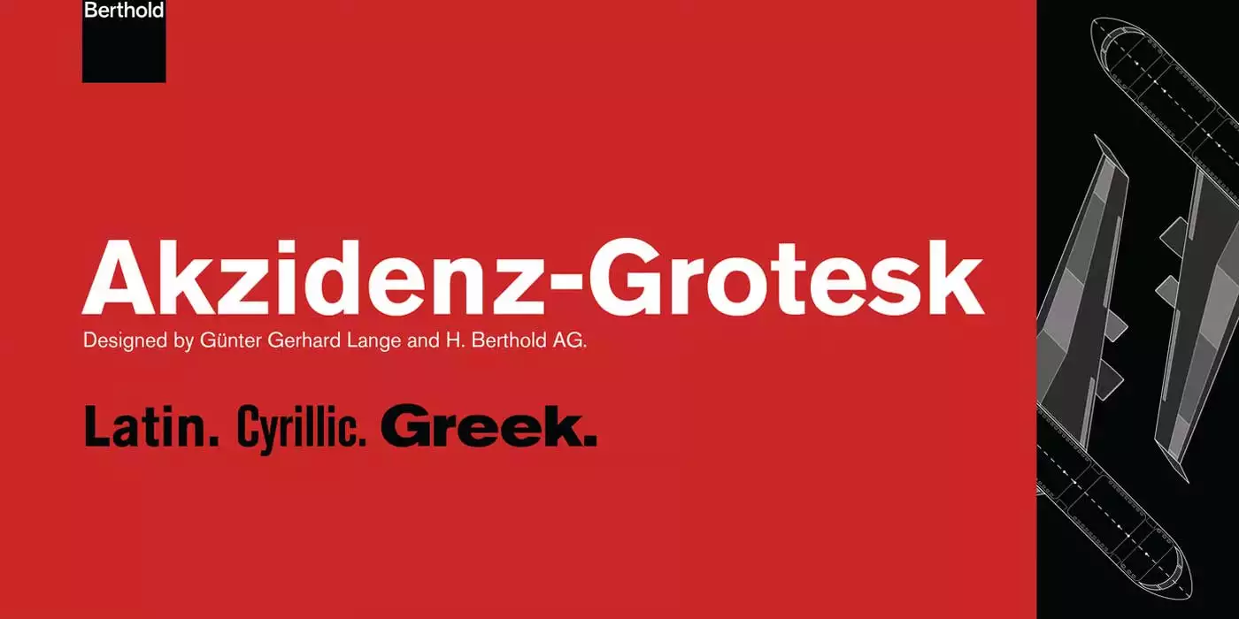
Akzidenz Grotesk, a sans serif font family, was introduced in 1896 by the Berthold Type Foundry based in Berlin. The name itself tells us that”Akzidenz” was designed for use in commercial printing (like advertisements and forms), while “Grotesk” was a typical name for sans serif fonts at the time.
The designers did not develop this font to become a piece of art, but to be simple and straightforward for everyday usage. However, its basic shapes, straight edges and lack of embellishments made it very functional. It evolved and peaked in the mid-20th century when designers adopted it into the International Typographic Style (Swiss Style) foundation.
Features
Akzidenz Grotesk has a universal appeal with a clean design that does not date from its balanced neutrality. Its shapes are clean and devoid of any carvings, which makes the chair highly versatile in terms of stylistic compatibility. The typeface has large counters, which enhance its readability despite its small-scale application. A characteristic element is the two-story ‘g’ – this is another element that is typical for many early grotesque fonts. The capital ‘G’ is also noticeable for its lack of spurs, which only serves to make it neater. The slight tilt at the end of the strokes of the font imparts some character to the font while at the same time not altering the neutrality of the font. This versatile typeface comes in many styles, with light, regular, bold, and heavy weights to match the needs of any project.
Usage
Due to its versatility, many projects opt for Akzidenz Grotesk for both web and print media. This font is in the logos of famous companies, including American Airlines and Swiss Re, and in their promotional materials because it looks both business-like and enduring. It is easy to read, which makes it popular for headlines and body texts in magazines and newspapers. The high level of legibility is particularly suitable for identification purposes and other information display purposes, such as signs. Due to the simplicity and lack of flourishes in the design of Akzidenz Grotesk, it fits well into websites and improves the legibility and overall look of the material designed for the web.
Similar Fonts to Akzidenz Grotesk Font
Akzidenz Grotesk is a famous font in the typographic world. There are several other fonts that share the same features:
Helvetica: Helvetica is one of the most popular sans-serif fonts derived from Akzidenz Grotesk; it has a clean and geometric look.
Univers: Another Swiss Style font, Univers, also has a large number of weights and has a slightly more humanistic look than Akzidenz Grotesk.
Franklin Gothic: This American grotesque font, however, seems to have a similar no-nonsense approach but with a slightly tighter structure.
Akzidenz Grotesk Font Free Download


FAQ’s
Is Akzidenz Grotesk a free font?
No, it is a commercial font, but some foundries provide trial versions.
Is Akzidenz Grotesk the same as Helvetica?
No, Helvetica is not the same as Akzidenz Grotesk, even though it takes its inspiration from it; Helvetica has a higher x-height and a more consistent stroke weight.
Can I use Akzidenz Grotesk for my website?
Absolutely! It is great for web design as the lines are clear, and the text is easily readable on screens.
What are the best font pairings for Akzidenz Grotesk?
This font is best to pair with a large number of other fonts, including such classical serif fonts as Garamond or Baskerville or such geometric sans-serif fonts as Futura or Avenir.


