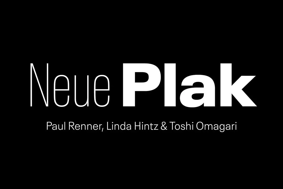
Neue Plak Font is the modern variation of the Plak typeface designed by the famous German type designer, Paul Renner. Renner is famous for his work on Futura and Neue Plak continues this masterpiece while adding a new dimension to the less famous typeface by Renner.
History
Paul Renner first developed the Plak typeface in the 1920s, when there was a lot of innovation and transformation in the graphic arts. This period witnessed the emergence of the Bauhaus movement, which entailed the adoption of functionalism and geometric shapes. Renner’s Plak was also part of this period, but it was different in having a more massive black design and a slightly condensed structure that made it ideal for advertising or posters.
Although Plak became popular with the passage of time, it lost its steam over the course of time, and the more geometric and easily identifiable Futura of Renner gained more prominence. However, due to certain qualities that were inherent in Plak, it became an ideal choice to be brought back in the digital age.
Monotype, a leading type design and font technology company, was behind the Neue Plak revival. It was not a mere exercise in digitization of Plak, but to adapt it for use in the current world yet keeping the essence of what Renner had created. This entailed a thorough literature review of historical literature and a close reading of the texts by Renner.
Neue Plak offers the same strong impact as the first version but with a set of new weights and styles, which make it more flexible. The font family extended with additional weights from Thin to the Black, with matched italics. This expansion makes Neue Plak suitable for a wide range of applications, from headlines and posters all the way to the text of editorial design.
Features
Neue Plak is notable for its strong and slightly eccentric lettering. This makes the strokes of the font thick and strong, making the font look dominant. Its slightly condensed width makes it space-efficient yet does not affect its readability. The slight condensation on its width does not affect the space occupied while maintaining readability. The contemporary design has been optimized to guarantee better readability in the context of the digital era, which has become the primary arena for the distribution of information.
Of all the characteristics that define Neue Plak, probably the most noteworthy is the way it treats curves and terminals. The rounded characters give a feeling of friendliness, which is quite opposite to the overall aggressiveness of the logo. Thus, Neue Plak is an interesting and versatile font that you can use to convey powerful and bold messages without compromising the overall character.
Usage
It has become popular among designers in different disciplines after its release. That is why it is suitable for branding, advertising, websites and editorials. The text in the bold weights looks very convincing for headlines and logos, while the lighter weights can be useful for more extended texts.
Those who want to incorporate a contemporary feel with a touch of historical art styles find Neue Plak useful. It is bold enough to catch the eye but not so much that it becomes distracting and difficult to read.
Similar Fonts to Neue Plak
If you like the design of Neue Plak and its features, you may also like these fonts that are similar in terms of being transparent, simple, and business-like.
Futura: Futura is a clean geometric shape modern font which is a classic sans-serif typeface that has some similarities with Neue Plak.
Avenir: Avenir is a sans-serif typeface by Adrian Frutiger with a geometrical look and feel that is at the same time contemporary and timeless.
Gotham: This is a modern font based on architectural lettering, giving a sleek and minimalistic feel.
Proxima Nova: Featuring clean, geometric shapes and contemporary proportions, Proxima Nova is a popular sans-serif font that works well for both print and web.
Nexa: The design of this font is clean and minimalistic, sans-serif with geometric construction suitable for application in various fields.
Neue Plak Font Free Download


FAQ’s
What is Neue Plak?
Neue Plak is a modern adaptation of the Plak typeface by Paul Renner in 1920s. It maintains the strong, sturdy look of the original, but provides new weights and styles for contemporary purposes.
Who designed Neue Plak Font?
It is designed by Paul Renner; a German typographer who also created the famous Futura font.
What are the characteristics of Neue Plak?
It has a strong, heavy appearance, with rather squarish shapes, slightly condensed letterforms, and some elegance in the curves and terminations. It is bold and nuanced at the same time, which gives it a kind of authority and friendliness all at once.
What are some of the common uses of Neue Plak?
Neue Plak is versatile and suitable branding, advertising, web design, and editorial design among other design projects. The font has strong weights that are suitable for titles and logos and the lighter weights are recommended for paragraphs.
Does Neue Plak support multiple languages?
Yes, Neue Plak allows for use in multiple languages, which is beneficial for global projects. It has a large number of glyphs to support different languages and scripts of the text.


