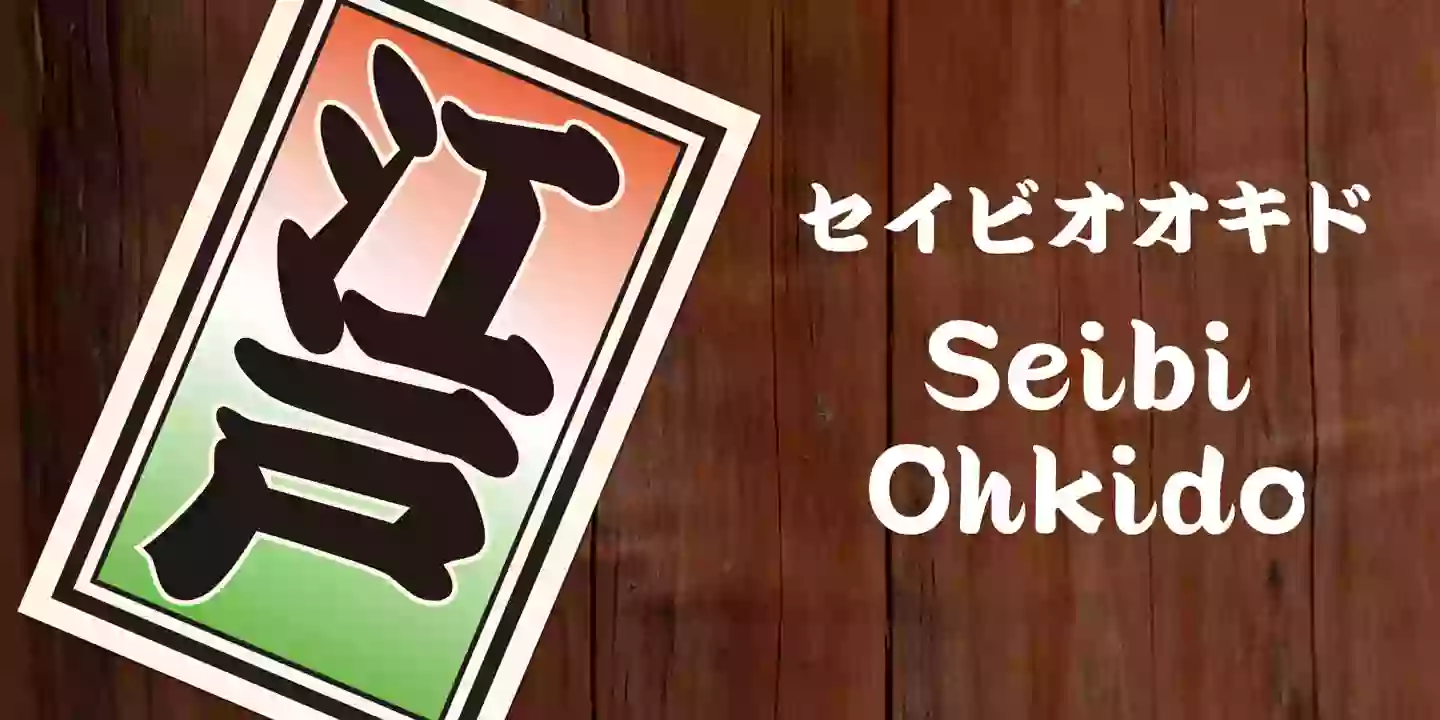
It is a font based on “yose-style characters” used in entertainment during the Edo period for signboards and the rankings of rakugo performers and flyers to attract customers. Kanji in the original yose-style characters is balanced with kana, and is made easier to read by controlling brushstrokes at oblique angles, rising to the right. While the font is arranged in a contemporary style tailored to both horizontal and vertical typesetting, you can still enjoy the essence of handwritten yose-style characters.
Seibi Ohkido Font Free Download


