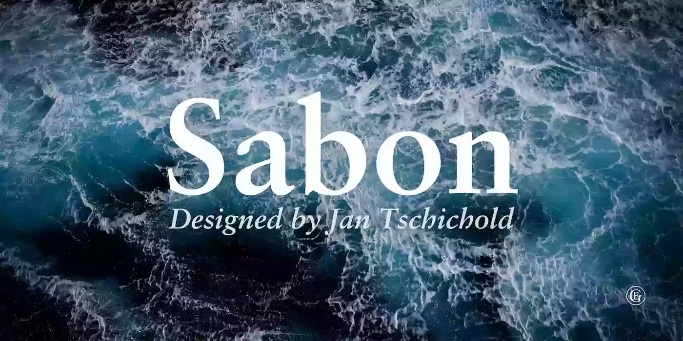
Sabon font is one of the most interesting typefaces with a history dating back to the 16th century. The font was named after Jacques Sabon, a famous French type designer in the Renaissance period, and is a fine example of the work done by the typographer. Sabon’s work greatly influenced typography, and his further contributions influenced the following generations of typographers.
Jan Tschichold, a famous typographer of the 1960s, developed the Sabon font from the Renaissance period style, including Jacques Sabon’s works. It became Tschichold’s challenge to give a contemporary look to these fonts, and this is how the Sabon font quickly became popular due to its classy and clear look. The Sabon font has clean lines, smooth and slightly rounded corners on the serifs, and equal margins between the thick and thin parts of strokes.
Features
Sabon features a tall x-height, which makes the font look contemporary and unenclosed. X-height is the height of the lowercase letters compared to the height of the uppercase letters of the given typeface. Sabon has a rather high x-height, which makes the font look quite harmonious and quite easy to read both on paper and screens.
The light and dark parts of the letterforms of Sabon are slightly different, which gives it a traditional and beautiful style that is suitable for many types of designs. One of the characteristics of Sabon is the presence of strong serifs, small strokes coming out at the end of the main lines of the lettering. The basis of the letters in Sabon is rather thin, but the serifs are clearly different, and the typeface looks quite graceful and elegant.
Below are the characteristics of Sabon that one must consider when employing it in typography to generate professional-looking designs.
Usage
It is quite famous in the world of print design and publishing and rapidly became highly popular mostly due to its remarkable readability and the timeless aesthetics. Designers and publishers found the font easy to use and liked the fact that it is ideal to use in any project as it was modern yet classic. Due to the font’s elegant serifs and harmonious dimensions, it is more suitable for the body texts of books, magazines, and newspapers, for which readability is a priority.
Moreover, it has a fine contrast between the thick and thin lines that provided a feeling of movement and vitality and that is why it is an ideal choice for the headlines and display purposes. Sabon font has played a very significant role when it comes to print design and publishing. Thus, the font became popular and over the years, the font’s aesthetic remains relevant in the graphic design industry even up to the present.
Both designers and publishers keep on using the Sabon font due to the clarity of the font, and its ability to give a timeless look to any project made with it, making it preferred for various uses.
Sabon Font Free Download