Roc Grotesk is a modern sans serif font family that was influenced by the American wooden types designed in the last quarter of the 19th century. This typeface family provides many styles and features that are suitable for any print and digital media productions.
History
Nikola Kostić designed this typeface, released by the Kostic Type Foundry in 2019 under the name Roc Grotesk. It takes it’s inspiration from American wood types of the late 1800s and standard grotesques such as Franklin Gothic and News Gothic. Kostic envisioned these to be a modern evolution of historical grotesque typefaces, combining the aesthetics of today’s design with the practicalities of the historical ones.
Features
It is also important to note that the design of the Roc Grotesk is more utilitarian than decorative. Both the lightest and the widest are deliberately created for display purposes, although they can still be functional in a certain way.
In the Normal width, horizontal spacing is consistent across all the nine weights, on the other hand, the Compressed width aims at saving space by using minimal horizontal space. This design decision contributes to the contrast between Compressed Thin and Compressed Heavy styles since it is intentional.
From Thin to Heavy, the stroke contrast increases, enhanced by the heavier weights, especially the uppercase E and R in the Black and Heavy styles.
The x-height of the Roc Grotesk is quite high and it also has relatively short descenders and ascenders as compared to other fonts. These features play a part in the readability and spacing of the typeface, maintaining that all capital letters are set to a certain height, which allows for dense setting of all caps texts in headlines and posters.
It has a somewhat larger character spacing for the purpose of setting large blocks of text, while the Bold version, although having a greater weight, comes in the package to keep the same width as the text set in the Regular style. This helps to maintain the visual continuity when switching between the weights.
Since tabular figures are available in both Regular and Bold styles, the two types of figures have the same width, which enables the author to highlight certain rows of numbers within a given data column while maintaining the appearance of the data. This way, OpenType features allow using alternative lowercase ‘g’ and ‘r’ shapes, which corresponds to the designer’s expectations regarding more traditional Grotesk typefaces.
Roc Grotesk Font Family
Roc Grotesk is a well-crafted font family providing 45 fonts, with five widths and nine weights to choose from. This vast category comes with five styles: Compressed, Condensed, Normal, Wide and Extra Wide so that designers can have a wide choice.
Language Support
The language support is also excellent, with the typeface supporting Western and Central European character sets, as well as Turkish. This universal Latin character set means that Roc Grotesk is suitable for use in many international projects.
Usage
Roc Grotesk font has a variety of weights and widths due to this it is suitable for a broad range of purposes. It is perfect for headlines and text, and looks great in print and online, so it is suitable for posters, magazine layouts, ads, logos, and websites.
The font is very simple, and has a more contemporary appeal to it, which can work well in both corporate, technology, and other creative contexts. Thus, Roc Grotesk has elements of both the past and the present that makes it useful in the current and future works without compromising on aesthetics.
Similar Fonts to Roc Grotesk Font
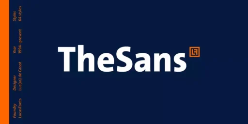
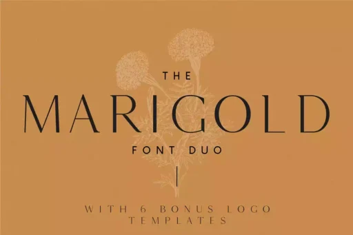
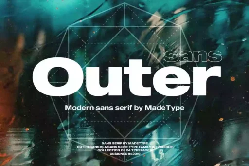
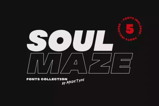
There are many similar fonts to Roc Grotesk, such as
Roc Grotesk Font Free Download


