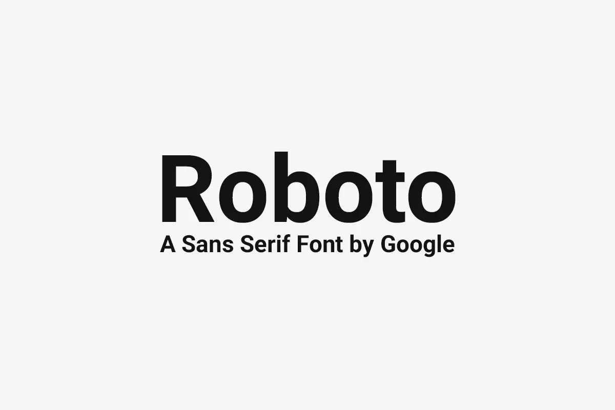
Roboto is a font that emerged from Material Design by Google. Material Design is a UI design language that Google introduced in 2014. It is a visual language grounded in design principles and then made more complex by technology and science. As part of this articulated design language, Google aimed to establish a typeface suitable for multiple platforms and devices. As they said, they envisioned it to be one that would portray today’s landscape of such technologies at the same time. This led to the development of a Roboto sans-serif typeface that has a clean geometric look and complies with the material design guidelines.
Roboto first came to light in August 2011 as a free font that people can download and use or customize. This was quite strategic since it made it easy for designers and developers across the world. So they can download and use the font in their projects, which helps to make the font more popular. Roboto is an open-source font. This made it possible to build on the years that followed while considering the feedback and changes in design trends.
Roboto typography is one of the most prominent and usual types of fonts in present-day digital and interface designs. It is available in multiple languages, supports any type of screen resolution possible, and is easily accessible to clients. Starting from the mobile application to a website, GUI, or whatever the needs of a designer and developer. Roboto has established its status as the go-to full-time contemporary and diverse font for all projects.
Evolution of Roboto Font
However, after the release of the first version of Roboto, the typeface went through multiple revisions and improvements for digital design. From chiming with emergent design aesthetics and styles. It has also adapted to technological developments as it continues to be useful in today’s contemporary digital environment.
Roboto was first released as a font that is simple yet very diverse and flexible and was soon adopted as a popular typeface by the designers and developers. Later updates concentrated on how best to improve the typeface and add as many new languages as possible to the typeface. These updates also cleared some problems with readability and the overall look in the web context, making Roboto still viable option for digital design.
Characteristics
Roboto font is described as clean and geometric, giving it one distinct feature. The typeface intends to depict open characters with rounded corners and a positive aesthetic for various professional practices. Roboto has a geometric appearance that is modern, trendy, simple and clear.
This brings another important factor that is the weights and the styles of these letters. From skinny and shiny to thick and dark, as thin as possible and as light as Helvetica Neue, this font is useful for designers and developers who seek a font that is thin to bold and light to black to create hierarchy and contrast in the design itself. Furthermore, the italic and condensed variant is very useful to use for a great variation in most designs.
Roboto is great at scaling up and down, establishing itself steadily and harmoniously across a variety of font sizes. In use — for body copy, headlines, and UI components alike — Roboto preserves legibility, so decided so that it doesn’t matter what, text is text remains clear and easy to comprehend. Roboto is a suitable typeface for digital interfaces, it is applicable at a small size as well as large DPI, mainly because of its flexibility.
Impact of Roboto Font on Digital Design
Roboto is a typeface that has made a tremendous impact in futuristic and modern designs to enhance the digital experience. Google developed it as one of its most iconic typeface designs for material design principles of modern UI/UX design. Being widely spread, it played a role in making the overall aesthetics of multiple digital products and services. It became one of the defining factors of the looks and feels of the digital world.
In addition to the shape, it loaned itself to an aesthetic appeal and began to impact the user experience and interface design. Due to its legibility, this typeface suits UI elements like buttons, menus, and labels for clear communication. In these cases, Its usage improves usability and accessibility, benefiting a broad audience’s digital interface experience.
Moreover, Roboto has already emerged as the style in structuring interfaces and many companies use this font as their branding element. Therefore, this text has become firmly embedded in today’s digital context, shaping our perception of digital information and experiences as well as their ways of delivery and consumption.
Roboto Font in User Interface Design
Today, many applications and websites use Roboto for its readability, especially in user interface design contexts. Since the typeface brings futuristic aesthetics to its design, it heavily fits well for user interfaces, such as buttons and menus or mere labels where readability is key. In the specific contexts mentioned above, including instances where buttons use text or when we need simplified forms of communication. Roboto enables intuitive and convenient interface layouts, particularly in contexts requiring simplified communication or text-based buttons.
It’s worth noting that one cannot overemphasize the influence of Roboto on the readability and ease of use of interfaces. Regardless of how one applies them – for body text, headings, or link text. Roboto maintains the necessary thinning when reduced in size and the necessary thickening when printed larger, and it is generally clear and precise. This is especially vital in situations where the content is to be delivered cross-device and in cases of high-definition screens, it does not distort the outcome. Its utilization in UI design benefits global digital enrichment, ensuring readability and ease across diverse screen resolutions.
Roboto Font in Web Design
When applying Roboto in web design, specific guidelines with notions that can be useful as guidance should be considered to maximize readability and interactivity. Designing with the typeface Roboto requires designers to apply font combinations to form an effective and aesthetically pleasing typographic system. Thus, by combining Roboto with other related typefaces and defining the typographical relationships between them, website designers can construct an agreeable and concise typographical structure for interfaces and objects that can better serve the overall design of websites.
The improvements related to the Roboto typeface for better web readability and optimization of its usage are vital to making a user’s experience much better. This need encompasses choices of data as an area of interest, text load and rendering, and the proper font weight and styles. This ensures readability across more than one screen size and density. By addressing these factors, it would be possible for designers to place importance on readability and usability to achieve the latter when applying Roboto in web design.
In sum, Roboto can potentially add substantial value to the design and utility of the website under consideration when utilized thoroughly and strategically. According to guidelines regarding implementation and usage, Designers can effectively utilize the typeface’s modern and highly versatile nature. The results to bring out the best in terms of visual appeal and usability in the websites they design.
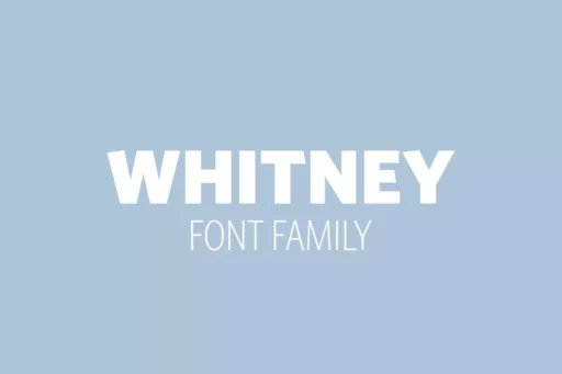
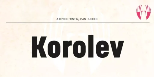
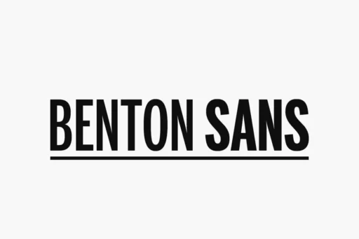
Roboto Font Alternatives
Roboto became popular enough and enlarged the targeting of digital and print typefaces. It is necessary to take into account other types and appreciate them as viable ones in comparison with contemporary counterparts in the aspect of design and readability. When designer tries to compare one typeface to the other, they try to select the best one that is most suitable for the given conditions such as the appearance of the used characters, the range of characters used and the ability to read the text.
When comparing Roboto to other contemporary trend typefaces, it’s crucial to discuss the features that influence the appearance of each of the typefaces. Although one could appreciate the functional, highly geometric look of Roboto, one could even venture to say that it appears cold and clinical, other typefaces could offer different visual characteristics, different, distinct personalities, which can help designers build quite distinct typographic systems for their projects.
Furthermore, the possible plausible areas of application and the benefits of alternative fonts in digital and print media should be researched. According to the uniqueness of a certain project, a number of typefaces show several benefits in providing support for various languages and ensuring readability across different settings and sizes of devices. Therefore, narrowing down choices other than Roboto allows designers to be more accurate when choosing a font that meets their demand and, ultimately, helps make their projects even better and user-friendly.
Roboto Font Free Download


What’s Included
- Roboto Italic
- Roboto Thin
- Roboto Thin Italic
- Roboto Light
- Roboto Light Italic
- Roboto Regular
- Roboto Regular Italic
- Roboto Medium
- Roboto Medium Italic
- Roboto Bold
- Roboto Bold Italic
- Roboto Black
- Roboto Black Italic
FAQ’s
What is the Roboto font?
Roboto is a sans-serif typeface by Google that is used as the font for its Android mobile operating system. Google designed it with an aim to be contemporary, ultimate and readable on such devices as are available today in the market.
What is the history of the Roboto font?
Roboto is a typeface that originated in 2011 from the drawings of the talented type designer at Google, Christian Robertson. While it was first introduced in the latest update of Android 4. 0 (Ice Cream Sandwich).
What are the characteristics of the Roboto font?
Roboto, as it famous for its clean and modern look and has no clear association with cheerful or negative emotions. Having geometric form, the open curves and the broad spectrum of weight and style options is its suitability for numerous digital uses.
Is Roboto font available for public use?
Yes, the Roboto font is free, open-source under the Apache License. You can use it for the personal and commercial design project.
What other fonts are similar to Roboto?
If you are looking more similar fonts to use then Arial, Lucida Sans, Franklin Gothic, Segoe UI, MS Sans Serif, Calibri fonts are the best options for you. Also, it is worthy of note that Open Sans in some ways is similar to Roboto.