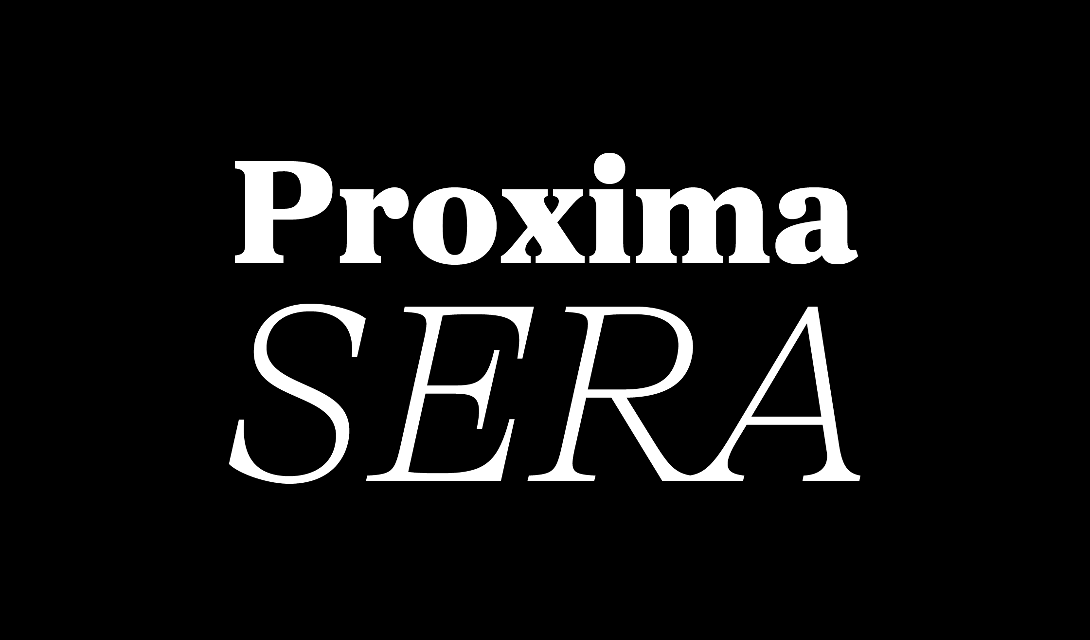
Proxima Sera (2022) answers the question that designers and typographers have asked for more than fifteen years—what serif typeface should I pair with Proxima Nova? Proxima Sera is a hybrid design, combining characteristics of old style and modern serif typefaces into something new that is clean and highly readable. While its proportions and range of weights are designed to harmonize with Proxima Nova, it stands alone just as well. Its even color and large x-height make it a logical choice for text settings, but Proxima Sera still has enough warmth for display use—especially Thin and Black. Try those in headlines, posters, or anywhere else you need to bring some fresh personality.
Proxima Sera Font


