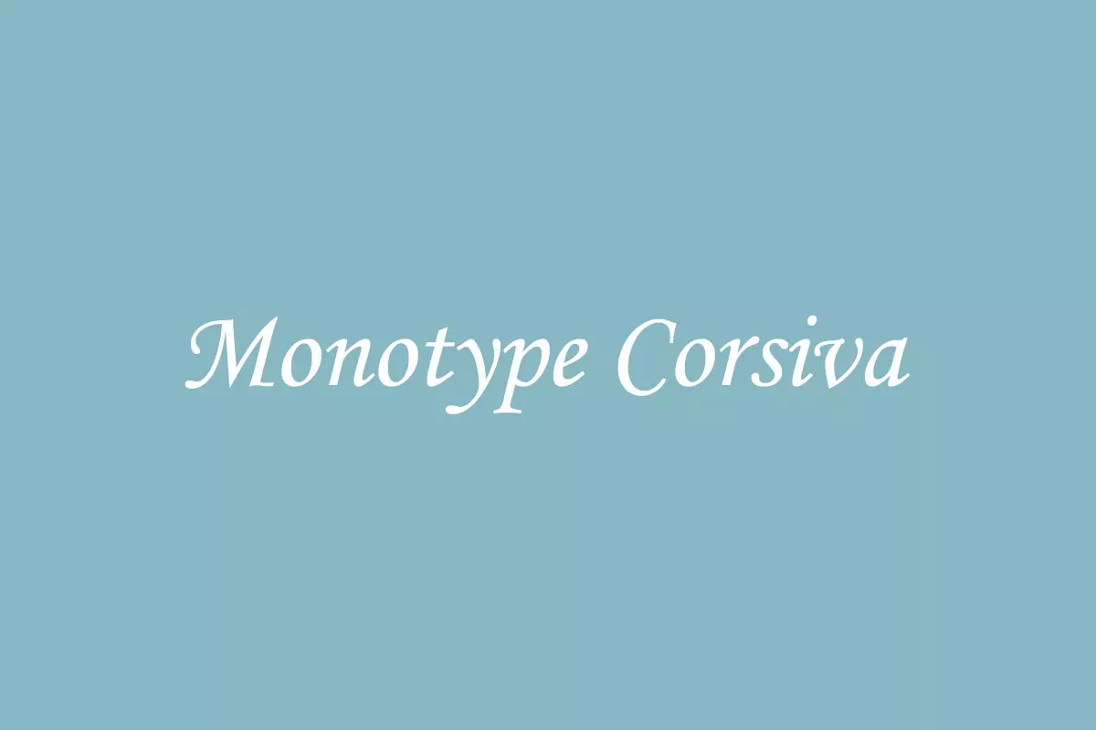
Monotype Corsiva is an elegant and antique font that conveys the feeling of history. Corsiva font is fluid and italic, resembling the calligraphy of the Italian Renaissance. Despite the fact that it is not very efficient for reading large texts, the font has characteristics which make it special in the field of typography and the finest choice for invitations, menus, headlines, etc.
History
Monotype Corsiva font was developed by Patricia Saunders and was published in 1995 by Monotype Imaging Inc., a prominent type foundry that houses a large collection of fonts. Saunders got the idea for the font from Italian cursive writing so he could make a font that had the feel of penned text. The outcome of this process was a typeface that incorporated the romanticism of handwritten fonts with the functionality of computerized fonts.
Monotype Corsiva is still in trend and is as much popular as it was earlier and this is because of its elegant look and versatility. Nonetheless, it is an ideal choice to use in various design fields, such as logo designs, product packaging, and website design, among others.
Features
Monotype Corsiva has a characteristic of italicized letters that have a flow and a handwritten look to them. This font is a perfect example of a calligraphic font as it has a smooth connection between the lettering and a uniform slant, which gives the font a professional look. The incorporation of elements like loops and swashes gives it an elegance that enhances the aesthetics of each character. Furthermore, Monotype Corsiva comes in a bold and italic style, helping the designers emphasize and establish the structure of the project. The font has a complete set of characters that is suitable for different languages and symbols, which makes it perfect for multilingual projects and various design projects. As a display font, Monotype Corsiva is highly legible, particularly at larger sizes, which makes it both attractive and useful.
Usage
This is because Monotype Corsiva has an elegant and readable style that makes it suitable for various applications. This is because of its elegant nature and elaborate look, which makes it suitable for use in invitations and greeting cards, among other things, as it gives them a more personal touch. Because of its distinguished but elegant look, Monotype Corsiva is especially suitable for certificates and awards where it adds professionalism. Monotype Corsiva often imparts a feeling of class and formality and helps in creating strong brand recognition when used in branding and packaging purposes.
The font is also quite common in the digital world, especially for creating graphics for social media profiles, website headers, and advertisements, where its unusual shape will help the text be noticed and gain the attention of the audience. In addition, Monotype Corsiva is applied in typographical art and decoratively styled prints, as the font is known to have fine strokes and elaborate touches that are ideal for decoration purposes.
Monotype Corsiva Similar Fonts
However, Monotype Corsiva has its own style and many other fonts have similar calligraphic and decorative elements.
Brush Script: Brush Script is cursive, but it is not as formal as Monotype Corsiva. It is a good choice to use in contexts where the speaker wishes to ‘break the ice’ or ‘relax’ the situation.
The Seasons Font: This font is another elegant, calligraphic typeface that looks very sophisticated. The Seasons Font is more decorative, with many ligatures and curves, and is ideal for certificates, invitations, and luxury brands.
Lucida Calligraphy: Lucida Calligraphy is a design by Charles Bigelow and Kris Holmes that features both legibility and calligraphic flair. It is useful in the same situations as Monotype Corsiva, for example, in invitations and certificates.
What’s Included
- Monotype Corsiva
- Monotype Corsiva Italic
- Monotype Corsiva Bold
- Monotype Corsiva Bold Italic
Monotype Corsiva Font Free Download


FAQ’s
Who designed Monotype Corsiva?
Patricia Saunders designed it in 1995 for Monotype Monotype Imaging, a renowned company with a premium fonts collection.
Are there different weights of Monotype Corsiva available?
Yes, Monotype Corsiva comes in various types of weight such as regular, bold, italic and etc. This versatility ensures that designers can be able to add emphasis and contrast in their designs while at the same time ensuring that the designs are all in harmony.
Why is Monotype Corsiva appropriate for formal documents?
The serif of Monotype Corsiva is very much suitable for official writings due to its calligraphic appearance. The design elements and the overall look and feel give it a touch of elegance and formality that is suitable for certificates, invitations, and awards.
Is Monotype Corsiva suitable for body text?
Monotype Corsiva is not limited to headings. And can be applied to the body text in some cases. However, due to its highly decorative nature, it is suitable for use at larger point sizes for enhanced readability.
Is Monotype Corsiva a free font?
Monotype Corsiva is not a free font. If you want to use it for commercial purposes you must purchase a license. The font is available for licensing from Monotype Imaging and other font stores.