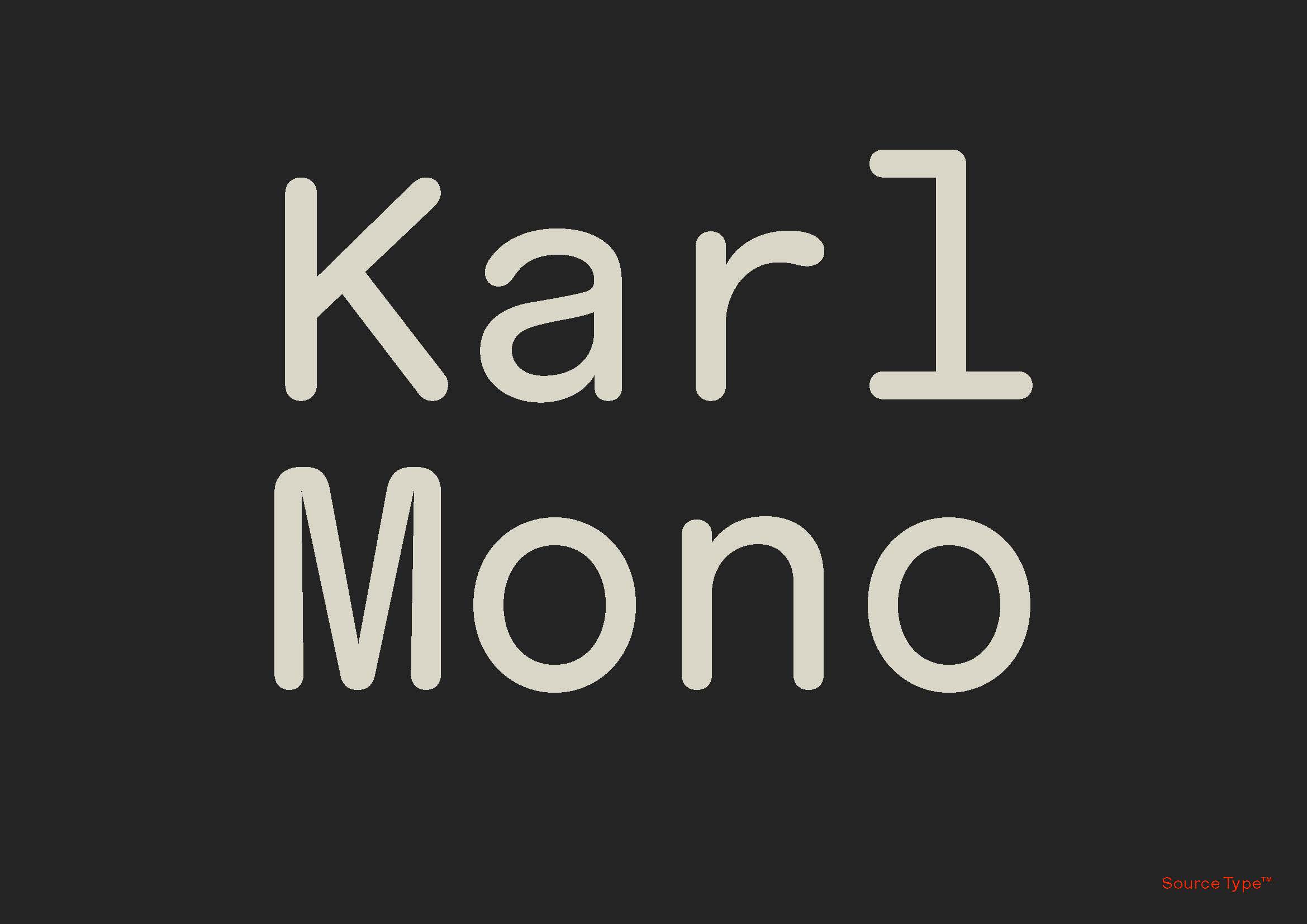
Karl Mono is the fixed-width stepchild of the robust Karl family, and a unique entry into the cannon of rounded fonts. The concept for Karl came to Laurenz Brunner during an apprenticeship at Gerstner’s agency (GGK) in the early 2000s after discovering drawings for a rounded sans-serif pitched to Shell. Brunner took inspiration from the sketches and expanded upon the pioneering concept, resulting in the release of various weights and styles of Karl. A mono cut, perhaps the farthest departure from Gerstner’s original plan, can be thought of as an inter-generational Swiss collaboration, rounding out a family of perfectly round characters…
Karl Mono Font Free Download


