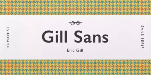
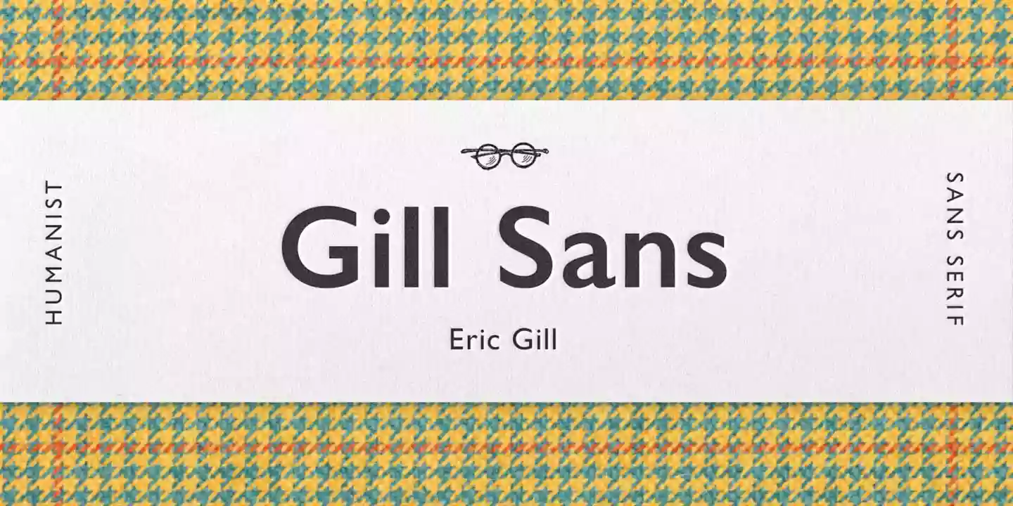
Gill Sans, a uniquely British font family, has had a long and successful life since it was first released in 1928. This timeless and highly adaptable font has adorned the pages of countless newspapers, magazines, brochures, and logos. It incorporates both antique and contemporary features and remains one of the most popular choices of designers and typographers to the present day.
History of Gill Sans Font
The history of Gill Sans started with Eric Gill, a British typeface designer, sculptor, and stone carver. In the 1920s, his friend Douglas Cleverdon asked him to design a sans-serif typeface for a bookshop. After seeing Edward Johnston’s typeface for the London Underground, Gill wanted to design a sleek sans-serif typeface. Monotype released the typeface that emerged from the project, initially called “Gill Sans-serif,” in 1928 as a contemporary, extremely readable sans-serif font.

There have been a number of extensions and variations of Gill Sans over the years, with Monotype extending the family with new weights and styles. In the modern world, designers and typographers have taken Gill Sans and adapted it to computer technology and other forms of the digital environment, making it relevant for today’s generation.
Features of Gill Sans Font
Gill Sans is a Humanist Sans Serif typeface, which means it is based on the proportions and structure of Roman inscription letters. It is distinguishable by its open counters, quite compact ascenders and descenders, and some individual letter forms, for instance, the expanded ‘R’ and the two-story ‘g’.
The typeface family is quite vast and encompasses a variety of weights from Extra Light to Ultra Bold and even Condensed and Italic. This makes it very suitable for a range of uses, including for text in books and magazines and for titles and logos in advertisements and branding.

Gill Sans is one of the most successful typefaces in terms of being legible. It is also very legible in both small and large sizes, which makes it ideal for the content of the website as well as headlines. Owing to its open punctuation and relatively large x-height, it is easily readable even in smaller sizes or on screens. It is also important to note that Gill Sans is quite versatile. It can be adapted for a large number of purposes, including branding and editorial design. This makes it an ideal symbol to use in conveying the dual idea of the conventional and the new.
Usage
Gill Sans, which is characterized by its traditional yet stylish design, is one of the most widely used typefaces in today’s advertising and branding fields. Many businesses have adopted Gill Sans to create a corporate, serious, and trustworthy tone. Many big companies such as the BBC, Penguin Books, and the Church of England have adopted the use of Gill Sans, thus making it very popular and easily recognizable by the general public.

When used in advertising, Gill Sans is very effective and versatile because it has clean lines and is perfect to use for both headlines and text. This is because its layout and overall dimensions are simple and neat, thus enabling the easy transfer of information. At the same time, in branding, Gill Sans’s reference to power and conservatism is useful for companies which are going to emphasize their authority. It is one of the most used fonts in logos and packaging as well as in advertisements, and it remains one of the most influential fonts of the twentieth century.
Similar Fonts to Gill Sans
There are some typefaces that look similar to Gill Sans, these include Johnston, Syntax and FF Scala Sans. All of the typefaces of this type are rather humanistic and have a graceful yet practical sans-serif look.
Gill Sans Font Free Download

FAQ’s
What is the Gill Sans font?
It is a sans-serif font by Eric Gill in the 1920s. It is characterized by its minimalistic design with some elements of humanism that make it different from other sans-serif fonts.
What are the major applications of the Gill Sans font?
This font has been used in many high-profile projects such as “Keep Calm and Carry On” posters of London and North Eastern Railway during the Second World War, BBC logo and London Underground signs.
What are the features of Gill Sans?
It is a humanist sans-serif typeface with open counters, short ascenders and descenders, and some special letters including the flare at the bottom of the ‘R’ and the double storey ‘g’.
What are the variations of weights and styles in Gill Sans?
Gill Sans comes in a variety of styles including Light, Extra Bold, and Condensed, as well as italic.
What’s Included
- Gill Sans MT Heavy OsF Italic
- Gill Sans MT Heavy SC
- Gill Sans MT Heavy
- Gill Sans MT Italique
- Gill Sans MT Light Italic
- Gill Sans MT Light
- Gill Sans MT OSF Bold Italic
- Gill Sans MT OSF Italic
- Gill Sans MT OSF Light Italic
- Gill Sans MT SC Bold
- Gill Sans MT SC Light
- Gill Sans MT SC
- Gill Sans MT Shadow
- Gill Sans MT Shadowed Light
- Gill Sans MT Ultra Bold
- Gill Sans MT
- Gill Sans Ultra Bold Condensed
- Gill Sans WGL Bold Italic
- Gill Sans WGL Bold
- Gill Sans WGL Italic
- Gill Sans WGL Light Italic
- Gill Sans WGL Light
- Gill Sans WGL
- Gill Sans Display MT Bold
- Gill Sans Display MT Cond Bold
- Gill Sans Display MT Extra Bold
- Gill Sans Infant MT Bold Italic
- Gill Sans Infant MT Bold
- Gill Sans Infant MT Italic
- Gill Sans Infant MT
- Gill Sans MT Book Italic
- Gill Sans MT Book OsF Italic
- Gill Sans MT Book SC
- Gill Sans MT Book
- Gill Sans MT Condensed Gras
- Gill Sans MT Condensed
- Gill Sans MT Ext Condensed Bold
- Gill Sans MT Extra Bold
- Gill Sans MT Gras Italique
- Gill Sans MT Gras
- Gill Sans MT Heavy Italic

