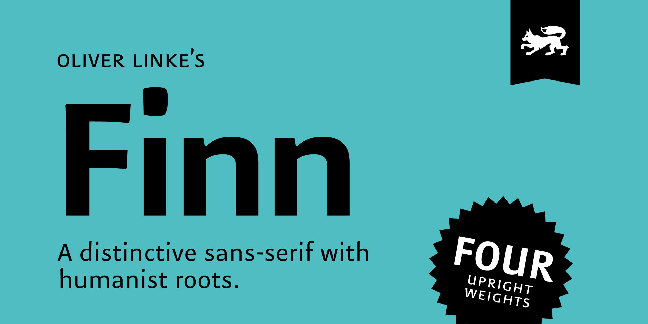
Finn Family has been carefully designed as a body typeface by Oliver Linke and especially tailored to increase readability of large amounts of text. Particularly spacing and kerning played an important role in the design process. Although a text typeface requires rather ordinary letterforms, Finn was furnished with charming details, that produce its distinctive warm and human appearance, without disturbing the process of reading. This makes it suitable for various typographic fields in contemporary graphic design. Finn Family is a bundle of four upright weights with one regular Italic. All fonts provide additional glyphs like discretionary ligatures, various figure sets, currency symbols and alternates. This extended character set enables the use of Finn Family in many different fields of high quality typography.
Font Preview


