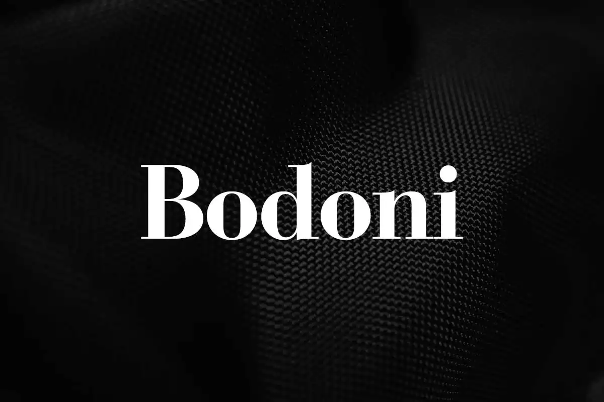
Bodoni is a font that is as elegant and modern today as it was in its early years. Bodoni has strong serifs, high contrast and geometric shapes, which are typical for the neoclassical period of the late 18th century. This typeface has been employed in fashion magazines and premium products, which makes the audience fall in love with it and consider it as elegant and classy.
History of Bauer Bodoni Font
Bodoni’s history began in the last quarter of the 18th century when Giambattista Bodoni, an Italian punchcutter, printer, and type designer, launched the typeface. Following the examples of John Baskerville and the Didot family of printers, Bodoni aimed at designing a type that would be both legible and aesthetically pleasing, with its letters and glyphs built on the principles of geometry.
His work reached its peak in the development of the Bodoni typeface, which he applied in his notable “Manuale Tipografico”, printed in 1818. This manual was a true example of the aesthetics and flexibility of his fonts, which made Bodoni one of the most important figures in the field of typography.
This typeface went through a number of revivals and adaptations in the 19th and 20th centuries, thus, increasing the typeface’s usage and popularity. Editions of the typeface by famous foundries, including ATF (American Type Founders) and Bauer, ensured the typeface’s longevity and the development of new versions to meet changing design tendencies.
Features of Bauer Bodoni Font
The beauty of Bauer Bodoni Font is in the details that make it iconic and versatile to this day.
Bodoni has a high contrast between heavy and thin lines as one of the distinctive features. This contrast results in a very obvious visual impact, which can greatly add to the overall appeal of any text. It has thick and thin lines that are vertical and horizontal respectively to create a harmonious and contrasting design.
The typeface also has another distinct feature of having very sharp and unbracketed serifs. The serifs are the fine finishing details at the ends of the letter forms or shapes. At Bodoni, these serifs are not bracketed, meaning that the stroke line ends and the serif begins without any transition, thus giving a very mechanical appearance. They also possess a horizontal or nearly horizontal axis which in turn gives the font a neat and systematic look.
Bodoni also has a characteristic of vertical stress where the vertical parts of the letters are heavier than the horizontal parts. This vertical direction makes the typeface look more formal, stable, and upright. It also helps in its readability since the vertical strokes help lead the eyes down as they read.
The linear construction of the Bodoni letters is another important aspect of the typeface design. The typography is dominant and defined by the use of circles, squares, and triangles; this gives it a highly organized look. This geometric aspect further enhances the whole typeface design to have that modern look and feel that is still relevant up to this date after being created in the 17th century.
Usage
These characteristics have ensured that Bodoni is suitable for use in a number of areas. It is therefore useful to turn to the Bodoni typeface when dealing with fashion and luxury branding as it is elegant and sophisticated. Its polished aesthetics convey a feeling of elegance and sophistication, it is suitable for logos, packages, and advertisements of elite products.
In editorial design, high contrast and highly readable, Bodoni font is ideal for headlines, titles, and pull quotes. The typeface is bold and commanding, making it impossible to overlook and thus capturing the readers’ attention within the text.
Bodoni also stand out in the display typography. It is very much ideal for posters, signs and other big size productions because of its bright and noticeable appearance. Bodoni, whether in a monochromatic scheme or as a part of a complex artwork, is eye-catching and lends elegance to the composition.
Even though the typeface is traditional, Bodoni is quite popular on websites and in digital media design. These features make it easily adaptable to the digital environment and only serve to enhance the aesthetic of any interface that incorporates it by providing a touch of sophistication and sophistication. From the titles of the websites to the captions of the social networks or advertising banners, Bodoni will add elegance to any online work.
Similar Fonts to Bodoni Font
If you are in search of other fonts that can provide the same kind of high-contrast serifs, then Didot, Walbaum or Modern No. 20 will do the job. Didot, a French typeface, is very similar to Bodoni in that it also has high contrast and sharp serifs, but it is typically more elegant in appearance. The German typeface Walbaum also has similar features but with relatively smoother edges. Modern No. 20, an American typeface that is based on the Bodoni design, has a slightly less contrasted look than the original typeface but still retains the classy appearance to it.
Bodoni Font Free Download


FAQ’s
What is Bodoni font?
Bodoni is a serif font which means that it has those small stroke-like features at the ends of its letters. It is characterized by its refined look, the sharp contrast between the thin and the thick parts of letters, and the unconnected serifs (the serifs do not have a curve leading to them).
Who created Bodoni?
Giambattista Bodoni, an Italian printer, created the first Bodoni typeface in the late eighteenth century. It was a revolutionary typography design during that period.
Is Bodoni suitable for use as a body text font?
Bodoni is not a bad choice for text, but it works best for small amounts of text. However, because of its high contrast, it may be tiring to read in large chunks of text, so it is advisable to use a less contrasting typeface for larger amounts of text.
Is Bodoni a serif or a sans serif font?
Bodoni is a serif font, which means that the letters have little flourishes at the ends of the strokes.
What is the difference between Bodoni and Didot?
Bodoni and Didot are similar in their characteristics, but the contrast and serifs of Bodoni are often more assertive than those of Didot. In addition, Didot has a more delicate look in general.


