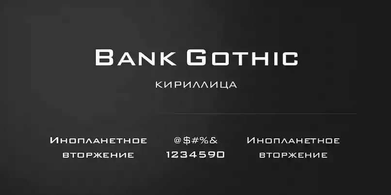
Bank Gothic is an expressive and powerful font with a vital essence of modernity, virtue, and efficiency. Morris Fuller Benton originally designed the typeface in 1930 for the American Type Founders (ATF) company. Since then, it has proven its time-resistant nature and remained one of the most widely used typefaces for many design applications.
Bank Gothic belongs to the Geometric Sans-Serif typeface class, characterized by its rectilinear elements, plain shapes, and absence of decorative ornaments. The composition of glyphs is mainly based on straight lines and angles, giving the typeface a neat and industrial look. Its simplicity and legibility contribute to the typeface’s versatility, making it suitable for various design endeavours.
This stout and solid aspect of Bank Gothic is one of its defining traits. The font catches attention and has the attribute of confidence, which makes it useful for headings, signs, and branding where visibility and impact are essential. Its substantial weight and the same stroke width ensure readability even at large font sizes. Therefore, it is a rational choice for both print and digital media.
The layout of Bank Gothic is consistent with the modernist spirit of the early 20th century, focusing on practicality, efficiency, and simplicity. Its geometric shapes and lack of ornamentation contribute to Bauhaus and other design movements of that period, making it a timeless example of modern typography.
Usage
Bank Gothic font is too popular because of its versatility and classical look. It is trendy in media and used for advertising campaigns, movie posters, album covers, and logos. This bold and eye-catching form enables the font to get effective messages across faster and more powerfully.
Bank Gothic font has been used in movies and has gained enormous recognition. Some examples are “Blade Runner” and “The Matrix,” which significantly increased their association with the themes connected to the future. One example is the use of a minimalistic style by famous brands like Nike and Coca-Cola in their advertising campaigns, demonstrating the potential of this typeface to grab the consumer’s attention and create a lasting visual impression.
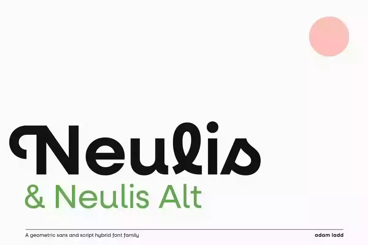
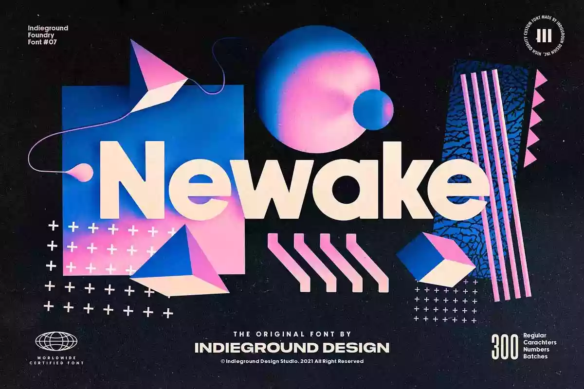
Bank Gothic font is widely used, but alternatives that are similar in appearance are also available. Such options may suit tastes if one wants to stand out or if Bank Gothic font is difficult to get hold of.
Bank Gothic Alternatives
1. Gotham: Gotham is one of the best-known and widely used geometric sans-serif fonts. It still resembles Bank Gothic font. It has a clean, modern appearance and is available in different weights and styles.
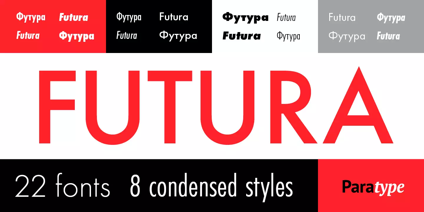
2. Futura: Futura is a geometric sans-serif font that has existed since the 1920s. It has a clean approach with a distinct geometric architectural structure allows it to serve as an alternative to the Bank Gothic typeface.
3. Bebas Neue: Bebas Neue is a free font, like Bank Gothic alternative font. It looks solid and condensed, which implies its use for headings and display purposes.
Bank Gothic Font Free Download


