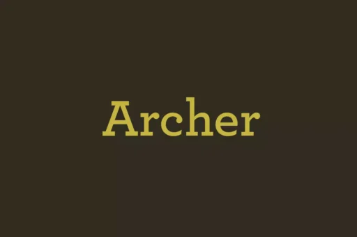
Archer is a slab serif font designed by Jonathan Hoefler and Tobias Frere-Jones, two renowned font designers in the world of typography. The two aimed at creating a slab serif typeface that was not the usual bold and robust in appearance, which is the norm within this category. They wanted a font that is both warm and friendly, playful without being too casual and could be easily read while maintaining a professional demeanour.
History
Archer can be traced back to 2001, when Tobias Frere-Jones and Jonathan Hoefler started working on a typeface design for the Martha Stewart Living magazine. The vision was to design a typeface that would harmonize with the magazine’s refined and chic demeanour while being suitable for general application. The outcome was Archer, which is a font that has both classic and contemporary characteristics.
Archer’s design was based on many historical fonts and cuts which are of the eighteenth and nineteenth centuries. Despite this, Frere-Jones and Hoefler intended to design a typeface that is an original creation that would not only be a reproduction of the past but a font that is relevant for the twenty-first century. Archer boasts simple geometric forms, clear counters, and a minimalistic approach, making it a highly flexible and readable typeface.
Features
One of the most prominent feature in Archer is its rounded terminals. Archer has rounded corners at the ends of the strokes, unlike the majority of the slab serif fonts that haveSquare-shaped corners. This is suitable for various uses including editorial and corporate design and branding, products, and advertisements.
The font family is quite versatile as it has thin to bold weights and comes with roman and italic styles. This helps the designers to match and select the right one for their projects and maintain the uniformity throughout the design materials.
Usage
Archer is one of the most versatile font of its kind. The design is simple and untangled which ensures that the text is easily readable in small sizes for the body text in print and online media. However, the distinctive personality and appeal of the font come through well even at larger sizes, which is perfect for headings and titles.
Archer in editorial design gives a classy look and elegant feel without necessarily becoming the focal point of the design. It is visible in numerous magazines and journals; the design of the product pairs well with the written content, enriching the reader’s experience. In the corporate branding context, Archer’s look, which is friendly and professional, helps companies portray professionalism and friendliness.
Similar Fonts to Archer Font
There are many fonts similar to Archer that share the same design principles. Some of them include:
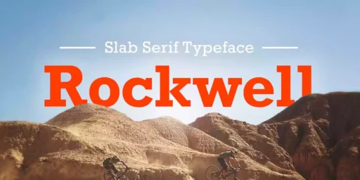
BrixSans: A slab-serif typeface based on the Archer’s design, proportion and overall appearance.
FF Tisa: A similar serif typeface with a humanist touch and large proportions.
Georgia: This is a clean and elegant serif typeface that has characteristics similar to Archer in terms of readability and functionality.
Archer Font Free Download


What’s Included
- Archer X Light Pro
- Archer Semibold Pro
- Archer Medium Pro
- Archer Light Pro
- Archer Light Ital Pro
- Archer Hairline Pro
- Archer Book Pro
- Archer Book Ital Pro
- Archer Bold Pro

