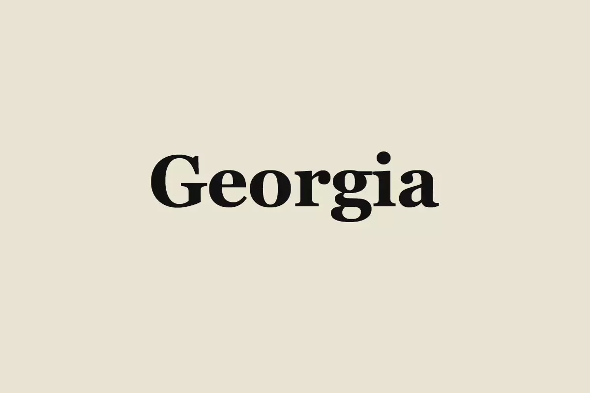
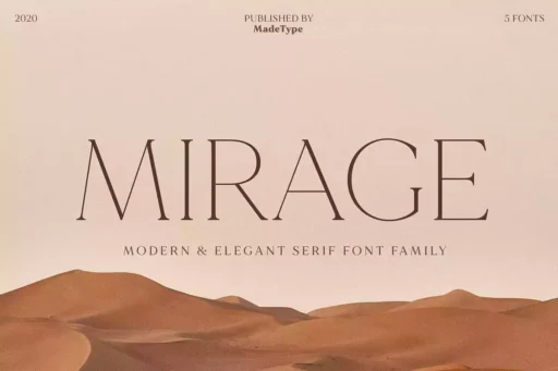
Georgia is a classical serif font created by its designer Matthew Carter in 1993. It is now one of the most popular and easily recognizable brand logotypes in the world of digital typography. Due to its sophistication and readability, Georgia is widely used in all forms of media, from print to screen, making it to the top for the covers and pages of many newspapers and magazines.
History of Georgia Font
The history of the Georgia font started back in the early 1990s when Microsoft approached Matthew Carter to design a new serif font that would look good and be readable on low-screen resolution computers. Drawing inspiration from Scotch Roman designs of the 19th century, Carter created a font that had an x-height with large and sturdy serifs for a highly readable typeface, even at small sizes.
The font, appropriately called “Alien heads found in Georgia,” a tabloid headline that caught Carter’s eye, released in 1996 and became popular. Its simplicity, symmetry, and clear typography made it a hit among designers and consumers alike. Georgia has become the font of choice for numerous publications, and in 2007, even The New York Times decided to use Georgia as its standard font, thereby consolidating its status as one of the most timeless typefaces.
Features of Georgia Font
There are particular aspects of Georgia’s design that have made it remain popular up to this day due to the features that it has in terms of the aesthetic and practicality of the font. Some of the factors that make it easy to read include its large x-height, which refers to the height of the lowercase letters such as ‘x’, and this is particularly helpful when displaying text on screens since texts that are too small can be difficult to read. The x-height in Georgia is slightly larger than some other serif fonts, and this makes the letters in the font look sharper and more recognizable even when scaled down.
The font also has strong serifs; these are the small strokes at the end of the letters at the base or at the top of the letters. Because these serifs are clearly and sharply cut, they serve as visual signposts that lead the reader’s eye along the lines of text, enhancing reading speed and comfort. These serifs are not too large to make reading difficult but, at the same time, not so large that they call attention to themselves more than necessary.
One more characteristic of Georgia is its open counters: the interior shapes of letters ‘c’, ‘e’, and ‘a’. This type of counter is larger than in other typefaces, which makes the letters look not crowded and illegible when the font size is small, which often happens with fonts displayed on low-DPI screens. The open counters serve to make the text feel fresher and more open. Moreover, the fonts in the package come in OTF, TTF and Web Fonts (WOFF, WOFF2).
Usage
Georgia is very versatile and that is why it is a best font to choose in numerous fields. It is often selected by publishers for books, magazines, newspapers, and other printed products that require clear and easily readable text. Georgia is more popular among designers for web design, email, and online document applications. Its versatility in being easily readable on different screens and resolutions of different devices has made it widely used by many websites and blogs.
Similar Fonts to Georgia Font
Even though Georgia is quite unique in its design, there are some similar fonts to incorporate in your design projects. Microsoft’s Times New Roman font is one of the most common and conservative serif fonts used in newspapers and academic papers for a professional and easily recognizable appearance. Another font that is close in look to Georgia is Miller by Matthew Carter, but with different proportions that make it feel slightly different but just as readable. Minion, a humanistic serif typeface, has a cheerful and unpretentious look; that is why it is an ideal choice for books and newspapers when the design requires more personality.
Georgia Font Free Download


FAQ’s
Is Georgia font free to use?
Although Georgia is not entirely free. It is available in many Microsoft products and might need a license for other commercial applications.
What are the best font pairings for Georgia?
Georgia goes well with the sans-serif fonts such as Verdana, Arial, and Open Sans to create a harmony and esthetically appealing design.
Is Georgia a good font for body text?
Absolutely! Georgia’s readability is excellent for use as the body text in print and electronic publications.
What’s Included
- Georgia Italic
- Georgia Regular
- Georgia Bold
- Georgia Font

