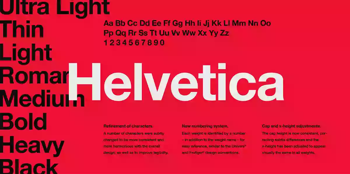
Helvetica is the most widely used font. It was created in 1957 by Max Miedinger, a Swiss typeface designer, and his partner, Eduard Hoffmann. In the beginning, it was called Neue Haas Grotesk. Still, the name changed afterward to Helvetica, a combination of the German name “Haas” and the Latin word “Helvetia,” which means Switzerland. The font was designed to be unbiased, modern, and easily read sans-serif.
Helvetica rose to fame due to its fantastic appeal and identification with the mid-20th-century modernist design movement. It was idealized by many graphics designers, corporations, and governments across the globe for its flexibility and clarity, hence its wide application in various areas.
History
Helvetica started with a Swiss-style font, a significant development in the 1920s. The Zurich design, called the International Typographic Style, focused on simplicity, transparency, and objectivity.
The design of Helvetica was created by Swiss designer Max Miedinger and his partner, Eduard Hoffmann. Miedinger is a Swiss typeface designer who collaborates with Edouard Hoffmann, owner of the Haas Type Foundry in Switzerland. Together, they aim to produce a font that represents the main idea of Swiss design and, on the other hand, allows for excellent legibility and variability.
Usage
The flexibility of Helvetica has been evident not only in typography but also in other media and industries. It is apparent in corporate logos, signs, adverts, print media, user interfaces, and digital platforms. Its neutral nature and decipherability allow information to be communicated clearly in small and large types.
The font’s minimalist and sophisticated appearance has made it a go-to choice for designers looking for a classic and professional appeal. Many famous brands, such as American Apparel, BMW, Jeep, and Nestlé, have used it on their logos and brand materials.
Features:
- It is simple, clean, and practical, with minimal stroke variations.
- A neutral look offers versatility in several applications and design styles.
- Perfectly legible in small type and larger sizes, and therefore suitable for both text and headline applications.
- Offer various weights and styles (regular, bold, italic, condensed, and extended), accommodating many design matches.
- Have an extended character set that can manage various languages and special characters to satisfy a broad global audience.
- However, the eternal attractiveness of the Art Deco style is the principal factor of its prolonged period in the spotlight and widespread use among different sectors and design contexts.
What’s Included
- Helvetica (TTF, 6 styles)
- Helvetica Neue (OTF, 11 styles)
- Helvetica Neue LT Std (OTF, 51 styles!)
- Bonus: Original Mac .dfont files for Helvetica and Helvetica Neue
Similar Fonts:
Many of the typefaces come with the particulars equivalent to Helvetica’s but also have some distinct elements. Some popular alternatives include:
Arial: Created to be an alternative for Helvetica, which is also by Monotype, Arial has similar design features yet has minor differences in letterforms and kerning.
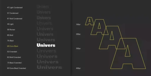
Univers: This is a creation of Adrian Frutiger. Univers is a generic sans-serif typeface possessing an extended range of weights and styles.
Gotham: Established by Hoefler & Co, Gotham is endowed with a clean and contemporary design with a little bit of geometric, hence the capability to meet the needs of the latest branding and design projects.
Helvetica Font Free Download


