Futura Font was created by Paul Renner, a German type designer, in 1927. Renner aimed to develop a font that reflected the spirit of his time – one that embraced progress and modernity while maintaining legibility and functionality.
Renner’s inspiration for Futura came from geometric shapes such as circles, squares, and triangles. He believed that these simple forms could create harmonious letterforms that were both visually appealing and easy to read.
Futura Font Characteristics and Features
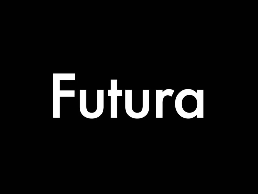
Futura Font is characterized by its clean lines, minimalistic design, and geometric shapes. It features uniform stroke widths throughout each letterform, giving it a balanced appearance.
One notable feature of Futura is its lack of serifs – those small decorative strokes at the ends of letters found in fonts like Times New Roman or Garamond. This sans-serif nature contributes to its modern aesthetic.
Compared to other popular fonts used in logo design like Helvetica or Arial, Futura stands out with its distinct geometric proportions and unique letterforms.
Why Futura Font is Ideal for Logo Design
| Timelessness | Designed in 1927, still widely used today |
| Versatility | Works well in various sizes and weights |
| Modernism | Reflects the Bauhaus movement and modern design |
| Brand recognition | Used by major brands such as Nike, BMW, and Apple |
Futura Font has gained popularity among designers for several reasons:
1) Timelessness: Despite being almost a century old, Futura still feels contemporary due to its clean lines and minimalist design.
2) Versatility: Futura works well in various logo design styles, from corporate to creative, due to its simplicity and legibility.
3) Readability: The geometric shapes and uniform stroke widths of Futura make it highly readable even at small sizes or from a distance.
4) Brand Association: Many successful brands have used Futura Font in their logos, creating a sense of trust and familiarity among consumers.
How to Choose the Right Futura Font for Your Logo
When selecting the appropriate variant of Futura Font for your logo, consider the following tips:
1) Purpose: Determine the intended message and personality of your brand. Different variants of Futura can evoke different emotions – some may feel more elegant while others appear more playful.
2) Legibility: Ensure that the chosen variant is easily readable across different mediums and sizes. Some variants may be better suited for headlines or larger text rather than small details.
3) Consistency: If your brand already uses a specific variant of Futura in other materials, it’s best to maintain consistency by using the same one in your logo.
Factors such as target audience, industry, and overall brand identity should also be taken into account when choosing a font for your logo.
Tips for Using Futura Font in Logo Design
To make the most out of using Futura Font in logo design, follow these best practices:
1) Pairing with Other Fonts: While Futura can work well on its own, combining it with complementary fonts can add depth and visual interest to your logo design.
2) Letter Spacing: Adjusting letter spacing (also known as kerning) is crucial when working with any font. Pay attention to how each letter interacts with its neighbors to ensure optimal readability.
3) Hierarchy & Weight Variation: Use different weights (such as bold or light versions) within the same font family to create visual hierarchy within your logo design.
Avoid common mistakes when using Futura Font, such as excessive letter spacing or using it inappropriately for a brand that requires a more traditional or ornate typeface.
Examples of Famous Logos Created with Futura Font
Futura Font has been used in numerous famous logos, contributing to their success and recognition. Some notable examples include:
1) Volkswagen: The iconic VW logo features the Futura Bold variant, which adds strength and stability to the design.
2) Absolut Vodka: The Absolut logo utilizes the Futura Extra Bold variant, giving it a bold and confident appearance.
3) Supreme: This streetwear brand’s logo uses the Futura Heavy Oblique variant, creating a sense of edginess and attitude.
In each case, Futura Font enhances the overall impact of these logos by conveying specific qualities that align with their respective brands.
Futura Font Alternatives for Logo Design
While Futura is widely popular, there are alternative fonts that can be used in place of it:
1) Avenir: Developed by Adrian Frutiger in 1988, Avenir shares similarities with Futura but offers its own unique characteristics.
2) Gotham: Designed by Tobias Frere-Jones in 2000, Gotham has gained popularity for its clean lines and versatility.
3) Proxima Nova: Created by Mark Simonson in 2005, Proxima Nova combines geometric shapes with humanist proportions.
These alternatives provide designers with additional options when seeking fonts that convey similar aesthetics to those offered by Futura.
How to Customize Futura Font for Your Logo
To create a unique logo using customized versions of the original font:
1) Letter Modifications: Adjusting certain letterforms can add personality or uniqueness to your logo design while still maintaining legibility.
2) Ligatures & Swashes: Explore ligatures (the combination of two or more letters into one character), as well as swashes (stylistic flourishes), to create a more customized look.
3) Color & Texture: Experiment with different colors and textures to give your logo a distinct visual appeal.
By customizing Futura Font, you can ensure that your logo stands out from others using the same font while still maintaining its core characteristics.
Futura Font and Brand Identity
Futura Font can play a significant role in developing a brand identity:
1) Modernity: The clean lines and geometric shapes of Futura convey a sense of modernity, making it suitable for brands aiming to appear contemporary and forward-thinking.
2) Simplicity: The minimalistic design of Futura allows brands to communicate simplicity, elegance, or sophistication.
3) Consistency: By consistently using Futura across various brand touchpoints, from logos to marketing materials, brands can establish a cohesive visual identity.
Brands like BMW and Louis Vuitton have successfully utilized Futura Font in their branding efforts to create distinctive identities that resonate with their target audiences.
The Power of Futura Font in Logo Design
In conclusion, the choice of typography is crucial when designing logos. Among the many fonts available, Futura has proven itself as an enduring favorite due to its timeless design and versatility. Its clean lines, geometric shapes, and lack of serifs make it ideal for conveying modernity while maintaining legibility.
When selecting the right variant of Futura for your logo design project, consider factors such as purpose, legibility requirements, consistency with existing branding elements if applicable. Additionally, follow best practices when using this font by pairing it with complementary fonts or adjusting letter spacing appropriately.
Famous logos created with Futura demonstrate its effectiveness in enhancing brand recognition and conveying specific qualities associated with each brand. However, there are also alternative fonts available that offer similar aesthetics if desired.
Customizing the original font can help create unique logo designs while still maintaining the core characteristics of Futura. Ultimately, Futura Font can contribute to the development of a brand identity by conveying modernity, simplicity, and consistency across various touchpoints.
In conclusion, Futura Font remains a powerful tool in logo design due to its timeless appeal and versatility. By understanding its history, characteristics, and best practices for usage, designers can harness the full potential of this iconic typeface in creating impactful logos that resonate with audiences.

FAQs
What is Futura font?
Futura is a geometric sans-serif typeface designed by Paul Renner in 1927. It is known for its clean, modern, and minimalist design.
What makes Futura font a good choice for logos?
Futura font is a good choice for logos because of its clean and modern design. It is easy to read and has a timeless quality that makes it suitable for a wide range of industries.
What are some examples of companies that use Futura font in their logos?
Some examples of companies that use Futura font in their logos include Volkswagen, Absolut Vodka, and Louis Vuitton.
Is Futura font free to use?
No, Futura font is not free to use. It is a commercial font that must be purchased from a licensed font provider.
Can Futura font be used for both print and digital designs?
Yes, Futura font can be used for both print and digital designs. It is a versatile font that works well in a variety of mediums.
What are some alternatives to Futura font?
Some alternatives to Futura font include Helvetica, Avenir, and Gotham. These fonts have similar clean and modern designs that make them suitable for logos.